Chapter 2
A Cook’s Tour of Lertap 5
· 14 November 2000 ·
Contents
Setting up a new Lertap 5 workbook
Statistics for cognitive subtests
Brief statistics for cognitive subtests
Full statistics for cognitive subtests
Upper-lower statistics for cognitive subtests
Statistics for affective subtests
Brief statistics for affective subtests
Full statistics for affective subtests
Our objective in this chapter is to get you started as quickly as possibly. In the next few pages we’ll have you getting into an actual test drive of the software. However, first a few important pointers.
This version of Lertap has been developed as an application which runs within Excel. Excel is part of a suite of programs known as Microsoft Office, often simply referred to as “Office”, usually with the version number appended, such as “Office 97”, “Office 98” (a Macintosh version), or “Office 2000”.
Excel is a spreadsheet program. Its basic “pages” are worksheets divided into rows and columns where information is entered, stored, and displayed. At times worksheets include “charts”, that is, graphical displays of information.
It is often easy to mistake an Excel worksheet for an ordinary page in a document prepared by a word processor, such as Word, another part of the Office suite. This potential confusion arises when Excel has been directed to hide its fundamental worksheet structure, something which may be done by selecting options which, for example, turn off the display of “gridlines”, and “row and column headers”. Many of the worksheets used in Lertap have their gridlines and headers hidden. These sheets may look like ordinary pages, but they’re not—they have Excel’s columns and rows propping them up.
Remembering this can be helpful at times. For example, it’s easy to change the appearance of Lertap “pages” by making their columns wider, or their rows higher, as one often wants to do when using tables in a word processor. To find out how to do these things, and how to turn the display of gridlines and headers back on, Excel’s extensive on-line Help system is an invaluable aid.
The files used in a word processor, such as Word, generally use the “doc” extension. The name of the file for this chapter, for example, is Chapter2.doc. In Excel, on the other hand, the common extension is “xls”. The name of the file which contains Lertap is Lertap5.xls.
Ready to get rolling?
Lertap5.xls
Find the Lertap5.xls file on your hard disk, or on your applications server, and open it.
This file contains “macros”. Lots of them. The macros contain the computer programming code[1] which forms the basis of Lertap. Lertap will not run until its macros are loaded, or “enabled”, as Excel sometimes says.
If Excel was not already running when you opened Lertap5.xls, it will be automatically invoked by the operating system on your computer. If the operating system cannot find Excel, you’ll be informed, and will need to seek help.
Starting with Version 5, an Excel xls file came to be referred to as a “workbook”. A workbook is a collection of worksheets. You’ll see an example of such a collection when you open the Lertap5.xls file.
When the Lertap5.xls file is opened, you should see a screen which resembles the one shown below:
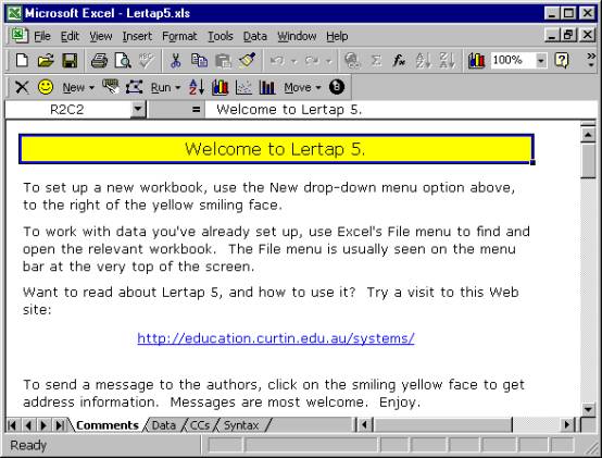
Here are some things to note at this point:
1.
One menu bar and two toolbars are showing at the top of the
screen. The menu bar begins with
options named File, Edit, and View.
2.
The upper-most toolbar is from Excel. It’s called the Standard toolbar. There are many other toolbars available in
Excel. To display, for example, the
Formatting toolbar, click on the View option, select Toolbars,
then select Formatting.
3.
The second toolbar is from Lertap. This is the one with the smiley yellow face towards its left-hand
side. If this toolbar is not showing on
your computer, it means that Lertap has not loaded correctly. This will happen if macros are not enabled. Macros must be enabled in order for Lertap
to be able to do its things.
4.
Below the Lertap toolbar the Excel Formula Bar is showing that
cell R2C2 of the current worksheet is presently selected. R2C2 means Row 2, Column 2. Rows run horizontally across the screen,
while columns run up and down. The
worksheet we’re looking at above has had its gridlines and row and column
headers hidden, and, as a consequence, it’s difficult to see where the actual
rows and columns are. But they’re
there, to be sure.
The Formula Bar also shows the contents of this cell to the right of the =
sign, “Welcome to Lertap 5”.
5.
The Lertap5.xls workbook is displaying two scroll bars. There’s the usual vertical scroll bar at the
very right of the screen, and, down towards the bottom, there’s a not-so-usual
horizontal scroll bar with two distinct parts to it.
Of these two parts, the right-most one is the conventional horizontal scoller,
one which lets you move from left to right on the “page” (or worksheet). The left-most part lets users scroll among
the various worksheets which belong to the workbook.
The Lertap5.xls file has four visible worksheets. Their names are shown above as “Comments”,
“Data”, “CCs”, and “Syntax” on the respective worksheet tabs seen towards the
bottom of the screen.
As Lertap goes about its business it will add more worksheets to the
workbook. Each sheet will have a name
and a corresponding tab. The number of
tabs can come to quickly exceed the space available for them in the horizontal
scroll bar, and this is when the little arrow heads to the very left of the
scroll bar become useful.
The four worksheets.
Now it would be useful to have a brief browse of Lertap’s built-in worksheets.
The Comments sheet, the one captured above, is the first sheet to show when the Lertap5.xls file is opened. It isn’t much, just a welcoming title page. If you’re connected to the Internet, a click on the hyperlink shown on the Comments sheet will take you to Lertap’s home page (which may also be reached by having your Web browser go to www.lertap.com).
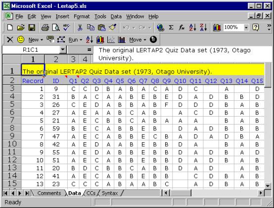
The Comments sheet may not amount to much, but the Data sheet, shown above, is packed with things to look at. It contains the responses of 60 people to 37 questions.
Of these, the first 25 questions have their responses recorded in columns 3 through 27 of the worksheet. The responses to these 25 questions, Q1 through Q25, consist of letters. These questions corresponded to a cognitive test designed to indicate how well the respondents had mastered an introductory workshop on the use of Lertap 2, a version which appeared in 1973.
The second set of questions, Q26 through Q35, have their responses in columns 28 through 37 of the worksheet. These ten questions were affective in nature, asking respondents to report their attitudes towards using Lertap 2. A 5-point Likert scale was used to record answers.
The last two questions had to do with the number of years which respondents had been using computers and tests in their work.
How many rows are used by the Data worksheet? If you have opened the sheet on your own computer, you’ll find that 62 is the answer. The first row has a title, the second has headers for the data columns, and the remaining, beginning in row 3, have the answers given by the respondents, one row for each respondent.
Some of the cells in the worksheet seem to be empty. Cell R3C14, for example, appears to have nothing in it. The respondent whose answers were recorded in row 3 of the Data worksheet did not answer Q12 (nor Q14; see R3C16).
Note how we’re saying that these cells “seem” or “appear” to be empty. We say this as it’s possible there’s a space, or blank, recorded in the cell (in fact, we know this to be the case—unanswered questions were processed by typing a space, which Excel calls a blank). Blank cells are not empty, even though they certainly appear to be.
Before looking at the next sheet, CCs (for
“Control Cards”), it will be worthwhile to summarise why we’d want to use
Lertap to analyse the results seen in the Data worksheet. We could think
of some “research questions” which we’d like to have answers to.
The results are from two tests, one
cognitive, the other affective. We’d
like to have a summary of response-, item-, and test-level data. We’d like to know, for example, how many
people got each of the 25 cognitive items correct. Which of these items was the hardest for the 60 respondents? What did overall test scores look like? Do the tests appear to have adequate
reliability?
The 10 affective items asked respondents to
reveal how they felt about their introduction to Lertap 2. What was it they liked and disliked? How did their attitudes correspond to how
well they did on the cognitive test?
We might also like to know how responses to
the cognitive and affective questions may have related to the experience levels
of the respondents. If they had been
using computers for some time, were their attitudes towards the software more
positive, or more negative?
In order to have Lertap answer questions such
as these, we first need to provide the system with what are referred to as job
definition statements. This is done in
the CCs worksheet.
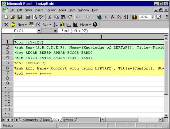
The CCs sheet shown above has 7 rows
of information. The first four have to
do with the first test, or “subtest”.
The *col (c3-c27) line tells Lertap
where the responses to the subtest’s items are to be found in the Data
worksheet.
The *sub card says that item responses were
recorded as upper-case letters, A through F, and gives a name and title to this
subtest. Titles are limited to eight
characters in length; Lertap (and SPSS) users get to be quite creative in
coming up with 8-character titles (called names in SPSS) which are recognisably
mnemonic.
The *key line gives the correct answer to
each question, while the *alt card indicates that the items did not all use all
of the response letters shown in the *sub card.
There are 25 entries on both the *key and
*alt lines, corresponding to the 25 items on the subtest. The correct answer to the first item, or
question, was A, and this item used just 3 of the possible response
letters. The correct answer to the
second item was E, and this item used 5 of the possible response letters.
The *col (c28-c37) line signals to
Lertap that there’s another subtest to be processed. Answers to its items are found in columns 28 through 37 of the
Data worksheet. The *sub card informs
Lertap that this subtest is to be processed as an affective one (“Aff”). The last line, *pol, indicates that some of
the questions were positive in nature, while others were negative. An example of a positive “question” would be
“This software is terrific!”, while the corresponding negative form might be
“This software is terrible!”.
This is an example of a worksheet where
gridlines and row and column headers have not been hidden. They’re also visible in the Data sheet shown
earlier. Notice how the first column in
the CCs sheet has been stretched so as to be extra-wide? Notice how the initial columns in the Data
worksheet are all narrow in comparison?
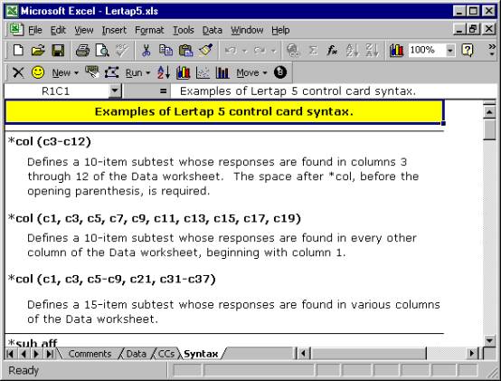
The last of the four visible worksheets in the Lertap5.xls workbook is named Syntax. This sheet is used to provide examples of what job definition lines can look like; it’s meant to serve as a sort of on-line reference which may obviate the need to refer to this Guide.
Users may add their own examples to the Syntax worksheet. How to do this is discussed in Chapter 10, Computational Methods.
Summary
The Lertap5.xls file is a workbook which contains four visible worksheets, and the collection of macros which effectively define the Lertap software system. The four worksheets are named Comments, Data, CCs, and Syntax.
Of these, the first and the last, Comments and Syntax, are information sheets. The Data and CCs sheets, on the other hand, are much more substantial, content-wise. They exemplify what a dinkum[2] Lertap Excel workbook looks like.
Let’s gather some speed. Ready to see some action? Open the Lertap5.xls file on your computer, and read on. (Maybe get a fresh cup of coffee or tea first.)
Setting up a new Lertap 5 workbook
We’re going to get you to set up a new Lertap workbook, and then show you how to do some actual data analysis. You must have the Lertap5.xls file open and ready to use.
What we’ll do is have you begin by making a copy of the Lertap Quiz data set, or workbook.
Go to the Lertap toolbar, and click on the New option on the Lertap toolbar.

Read the Comments if you’d like. Then click on the last option, the one which says “Make a new Lertap 5 workbook which is a copy of the present one”.
You’re likely to use this option quite a lot in the future, as your Lertap career gathers momentum. You’ll develop your own data sets, and some of them will probably becomes templates, that is, examples which will be used over and over. Actually, it’s even more likely you’ll use the option which says “Make a new Lertap 5 workbook with present Data header rows”. This option creates a copy of your “template”, but leaves the data lines empty, ready for you to add new results.
Okay, then, here we are. You’ve clicked on “Make a new Lertap 5 workbook which is a copy of the present one”. What did Lertap have Excel do?
It should have created a new workbook with two worksheets. The worksheets should be copies of the Data and CCs sheets seen in the Lertap5.xls file. Excel probably named the new workbook “Book1”, or “Book2”, or something like that.
How can you tell the name of the workbook? Look way up at the top of the Excel window. The very top line, the window header, will have an Excel icon, the words “Microsoft Excel”, followed by the name of the workbook.
You can have lots of workbooks open at the same time. Switch from one to the other by working through Excel’s Window option, available on Excel’s Standard toolbar.
So, what happened? Do you have the new workbook ready? Its Data worksheet has two rows of header information, followed by 60 rows of results? Its CCs sheet has 7 lines of job definition statements?
Good. Green light. Proceed.
Interpret CCs lines
Let’s ask Lertap if it can understand the definition statements found in the CCs file.
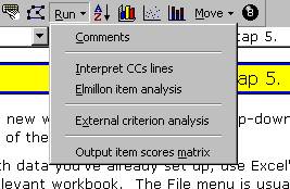
Lertap goes off and has a look at each line in the CCs sheet. If it finds a syntax error it will gently slap your hand, and stop, asking you to attend to the problem.
If it finds no errors, Lertap has Excel add some new worksheets to the workbook. For each of the *col lines found in the CCs sheet, Lertap creates a new “Sub” sheet. It also creates a “Freqs” worksheet.
The Sub worksheets are then hidden from view, and the Freqs worksheet comes to centre stage.
What’s this “hidden from view” stuff? Any Excel workbook may have many worksheets, up to 255 in the latest versions of Excel. Worksheets which are not used very much, or which contain data used only by the workbook’s macros, may be hidden by using Excel’s Format options. The Sub sheets fall into the latter category—they’re “system” sheets which Lertap uses to store operational data related to your workbook. You can unhide them if you want, but, if you do, you must promise not to change their contents.
The Freqs worksheet
“Freqs” means “Frequencies”. When you ask Lertap to “Interpret CCs lines”, it does a bit more—it has a close look at the data columns referenced in *col lines, and makes a tally of response popularities. Look:
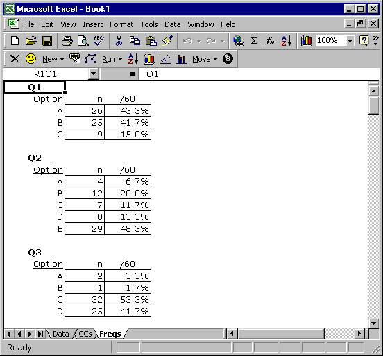
The Freqs sheet contains information which even a rocket scientist might be able to understand, hopefully with little trouble.
For each item, or question, Freqs reports on the number of times letters or digits were found in the respective item column number in the Data worksheet. For Q1 there were 26 As, 25 Bs, and 9 Cs.
The Freqs column headed “/60” indicates that a total of 60 data records were found, and gives the percentage associated with each frequency. For example, there were 26 As for Q1, which is 43.3% of the total number of 60.
As you scroll through your own Freqs sheet, you’ll come across some rows which have a ? mark on the left. For example:
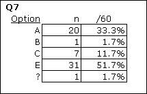
What Freqs is saying is that there was one response on Q7 which was not a letter or a digit. You can find out what it was by going back to the Data sheet, and browsing down the column with Q7 responses (column 9). If you do this, you’ll find a blank at R17C9, that is, Row 17, Column 9. If you were able to question the perpetrators of the Lertap Quiz, they’d tell you that blanks mean a person did not answer the question.
Why doesn’t Freqs show a “D” for Q7? Because nobody chose that option.
While being mindful of Freqs’ feelings, we can point out that it’s a simple, no-nonsense summary of response frequencies. It has no pretences; it does not claim to be sophisticated.
But it’s useful, isn’t it? It quickly summarises what went on in the data set. And, very importantly, it’s a sure-fire way to see if there are any weird responses in the data columns. For example, if the Q7 tally had included an X, that would be weird as only responses A though F were valid.
What if you do see weird results in Freqs, and want to quickly find the responsible records in the Data worksheet? Excel has a set of Data options offered on its Standard toolbar, and one of them is Filter. This is a powerful little option which will let you rapidly find records which have “weird” results. (If you try this, keep in mind that Excel’s on-line Help is there to assist you, should you have questions on how to use the Filter option.)
Moving right along are we. We’ve seen Freqs, and clamour for more. What else can Lertap show us? Quite a bit.
Back to Lertap’s Run options, where we now click on “Elmillon item analysis”. You should do the same.
Elmillon item analysis
Why would anyone name their child Elmillon? Talk about weird. Well, it’s a label which was applied to the first version of Lertap when it was under incubation at the Venezuelan Ministry of Education in 1972.
Is it ready? Is it ready? Day after day staff in the Data Bank heard that question. When it finally did hatch, the section chief, Rogelio Blanco, looked it in the eye and said “Un millon!”, which in Caracas is a popular way of saying “thanks a million”. Since then the main item analysis part of Lertap has been called Elmillon. Naturally.
So. Did you go to the Run options, and click on “Elmillon item analysis”?
After you did this, did you notice Lertap flashing a variety of messages to you? Trained Lertap users have a keen eye for Excel’s Status Bar, which is where the system often talks to you. The Status Bar is at the very bottom of the Excel window, where the word “Ready” is frequently seen. When you give Lertap a task to do, it will keep you advised on its progress by displaying little love notes in the Status Bar.
Don’t have a Status Bar on your screen? Use Excel’s View options, and put a tick next to Status Bar. Highly, highly recommended.
Back to business. After you clicked on “Elmillon item analysis”, what happened?
Lertap snuck[3] off to have a read of all the data it stored in those secret (hidden) Sub files which were by-products of the “Interpret CCs lines” stage. Then it read through the Data file two or three times, compiling test scores, writing three summary results worksheets for the cognitive test, and two for the affective test.
These new sheets should have their tabs showing at the bottom of the Excel window, as seen here:
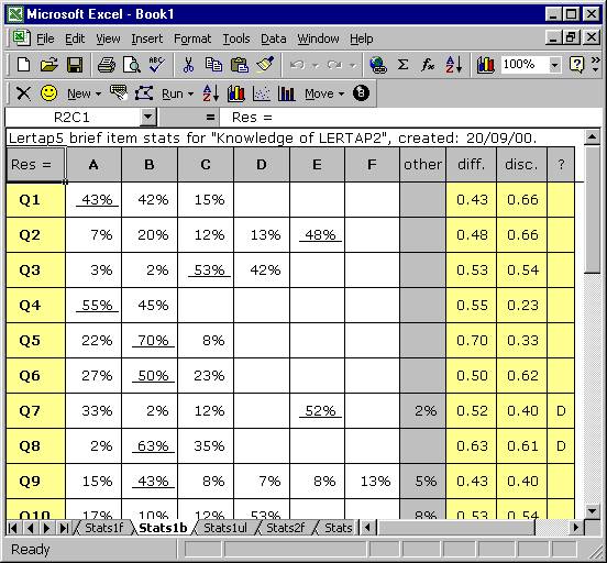
See the names Stats1f, Stats1b, Stats1ul, and Stats2f? At this point the new workbook has 9 visible (unhidden) worksheets, but only a few tabs fit into the little viewing area at the bottom of the screen. Now you can use those wee arrows at the bottom left and, as you do, different tabs will come into view. Way over to the left, for example, are the tabs for Data, CCs, and Freqs.
And now congratulations are in order: you’ve done it—set up a new Lertap workbook, obtained a Freqs listing, examined it closely for weirdness, and then gone on to have your new friend, Elmillon, analyse your data and “print” results to a series of new worksheets. Well done. Your Lertap career looks promising.
Next: take a break. When you return we’ll have a squiz[4] at what Elmillon has done. Perhaps you should take a long break—there will be quite a bit to look at, and you’ll want to be wearing your freshest eyes.
Scores
Each of the *col lines in the CCs worksheet is said to define a “subtest”. Subtests may be cognitive or affective. Cognitive tests measure knowledge or achievement, while their affective counterparts attempt to assess such things as attitudes, opinions, and feelings.
There are two *col cards in the Lertap Quiz’s CCs worksheet. The first one points to a total of 25 columns in the Data worksheet, the second points to 10.
There’s a *key line shortly after the first *col card, and this tells Lertap that the first subtest, with 25 items, is to be scored as a cognitive test.
The common procedure for scoring responses to cognitive questions is to award one point for each correct answer, and this is what Lertap does. It’s possible to award more points, and it’s possible to have more than one right answer to any cognitive item. These things are accomplished by putting *wgs and *mws lines in the CCs worksheet—but best we leave these “advanced” matters for a later chapter. And so we shall.
The first *sub line gives a title of “Knwldge” to the first subtest. What will be the possible range of scores for Knwldge? From zero to 25. As we’ve just said, this is a “common”, or standard, cognitive run, there are no *wgs or *mws lines in the CCs worksheet. Consequently respondents get zero points for each incorrect answer, and one point for each right response. There are 25 items, so the maximum possible score for Knwldge is 25.
The second subtest, “Comfort”, is affective in nature, something Lertap detects by the presence of the “Aff” control “word” on the *sub card. There are 10 items in this subtest. Lertap will score each, adding results from each item to derive a total Comfort score.
How? Good question. The answer may be obvious to users of earlier Lertaps, but probably not to other readers.
Lertap assumes that each affective item will use 5 possible responses. In fact, it assumes that Res=(1,2,3,4,5). What’s this Res=() thing mean? Two things. The number of characters found within the parentheses tells Lertap how many possible responses there may be to any item, while the characters themselves, five digits in this case, are the responses which will be recognised and scored.
How? If someone has an answer of 1 to the first affective item, how many points are awarded? One. Two points for the second response, which is a 2 in this case. Three for the third, four for the fourth, five for the fifth.
This is a common way of scoring affective items. Lertap allows for many other possibilities, scoring-wise. There can be more than five recognised responses—there may be as many as 10. The responses do not have to be digits. The points given to the responses do not have to correspond to the ordinal position of the response—special lines in the CCs worksheet, such as *mws lines, allow other scoring schemes to be effected.
Okay then, the subtest we’re talking about, Comfort, has 10 items. The minimum possible score on any single item is 1 (one), while the maximum is 5. For the 10 items as a whole, then, the minimum possible score is 10, the maximum 50.
We’re just about ready to look at the scores themselves, but first one final matter. The Comfort subtest has a *pol line associated with it—“pol” means “polarity”. The *pol line has ten plus and minus signs, one for each of the subtest’s items. The first sign in the *pol card is +, which means that a response of 1 (one) on the first item will get one point, while a response of 5 will get five points. This is referred to as “forward” weighting.
Items whose respective entry in the *pol card is minus will be reverse scored. On these items, a response of 1 (one) will get five points, while a response of 5 will get one point.
Why get into this sort of caper? Because it is not at all unusual for affective tests, or surveys, to consist of a mixture of positive and negative items. People might be asked to state whether they agree or disagree to a series of statements. The first one might be, for example, “Lertap is great!”, while the second might be “I would not advise anyone to use Lertap.” People who are happy with Lertap, which of course is just about everyone, would be expected to agree with the first statement, and disagree with the second. The use of *pol lines makes it possible to accommodate forward and reverse scoring with some ease.
Let’s see them then. Let’s have a squiz at these scores, Knwldge and Comfort.
Where are they?
They’re in the Scores worksheet. Find its tab at the base of the Excel window. Click on the tab. Look:
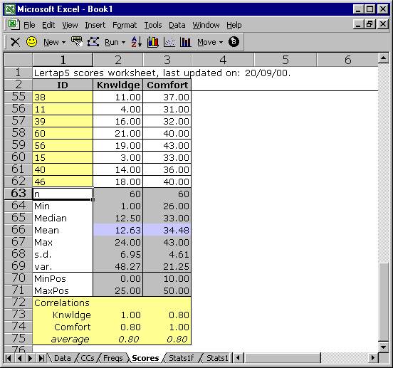
What do you make of it, this Scores sheet? It uses 75 rows, and 3 columns. Lertap presupposes that the first thing you want to rest your peepers on, as far as the Scores sheet goes, is the summary statistics section at the bottom of the sheet. This is why rows 3 through 54 have scrolled off the display. If you scroll to the top of the sheet, you’ll be able to satisfy yourself that there are 60 sets of scores, one pair, Knwldge and Comfort, for each respondent.
Are the summary statistics self-explanatory? Good. You can find out how they’re calculated in Chapter 10, Computational Methods.
A couple of quick comments before moving on. The MinPos and MaxPos scores are the minimum and maximum possible scores on each subtest, while Min and Max are the lowest and highest scores actually earned by the 60 respondents. The correlation coefficients are Pearson product-moment coefficients (the most common kind).
Is it possible to get percentage scores? You bet. Use the “Per” control word on the *sub card. It’s also possible to get a “scale” score if the subtest is affective. Such scores divide the original subtest score by the number of items in the subtest, a procedure which is common to quite a number of internationally-known affective instruments[5]. Scale scores are requested by using the “Scale” control word on a *sub line. More about these fancy control words, and others, in a later chapter.
Is it possible to get a total score, one which sums up the scores earned on the individual subtests? Most definitely. In fact, Lertap has to be told not to do this, something which is done by using Wt=0 statements on *sub cards. In the present example, each *sub line has this sort of statement. We didn’t want a total score—we didn’t think it made much sense to add together results from two very different subtests, one cognitive, one affective.
Doing more with Scores
Once a Scores worksheet has been created, there are a few icons on Lertap’s toolbar which let you do more with them:
![]()
The first of these three icons lets you sort the Scores worksheet according to criteria which you provide. Lertap calls on Excel to do sorts, and Excel has a very good sorter (nothing sortid about it, if you will). You can sort on IDs so that the scores are in alphabetical order; you can sort on any particular score so that they’re displayed in ascending or descending order.
The Scores worksheet, like all Excel worksheets, may be printed with ease.
Histograms
Here’s a pretty picture of the Knwldge scores:
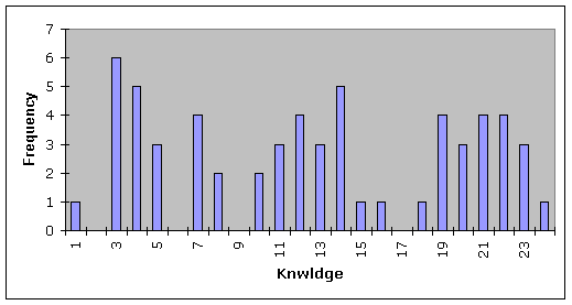
How to? How to make beauties such as this? Use the second of the three icons mentioned above, and please note: the Excel system in use on your computer has to have what’s called the “Analysis ToolPak add-in” installed before the histogrammer will give you pictures such as this one. If you don’t have it installed, it’s easy to do—look in Excel’s on-line Help, or refer to Chapter 10, Computational Methods, for more comments.
Scatterplots
You asked for it, you got it. Click on the third icon mentioned above, answer a couple of easy questions, and lo:
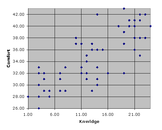
Lertap asks Excel to use one of its standard charts for the scatterplot, and, as a consequence, the Analysis ToolPak add-in is not required.
You’re doing well, you really are. Ready for more? Let’s leave scoring matters, and get into response, item, and subtest statistics.
Statistics for cognitive subtests
Three worksheets of statistics are usually produced for each cognitive subtest. These are referred to as the “full”, “brief”, and “upper-lower” sheets. The information provided by these sheets often overlaps to a considerable extent, as you’re about to see.
In the case of our running example, you should notice that Elmillon added sheets called “Stats1f”, “Stats1b”, and “Stats1ul”. These three sheets correspond to full, brief, and upper-lower statistics for the first subtest. You’ll notice that there are two others sheets of this ilk, named “Stats2f” and “Stats2b”. These relate to the second subtest, the affective one.
Brief statistics for cognitive subtests
Have a look at the Stats1b worksheet.
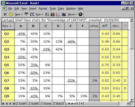
This sheet has its row and column headers hidden, but the contents of the first row are obvious: a header, a title. Note that it includes the name of the subtest, as given in the corresponding *sub line in the CCs worksheet.
The second row in Stats1b displays the responses used by this subtest, from A through F. The “other” column is used to indicate how many weird responses were found for each item. Going to the right, “diff.” means item difficulty, and “disc.” means item discrimination. The “?” column is used to indicate which, if any, of the item’s distractors might be regarded as rendering questionable service.
You’ll note that each item’s summary statistics are presented in a single row. The percentage figure which is underlined corresponds to the item’s correct answer, as taken from the corresponding *key line in the CCs sheet.
The derivation and interpretation of the diff., disc., and ? columns is discussed below, and in subsequent chapters. The information in the brief stats sheet is taken from lines found in another of the three statistical summaries, the “full stats” sheet, Stats1f.
Full statistics for cognitive subtests
The Stats1f worksheet contains a wealth of information, presented in several sections.
The first section gives detailed statistics for each item, as seen here:
Q1
|
|
|
|
|
|
|
|
|
option |
wt. |
n |
p |
pb(r) |
b(r) |
avg. |
z |
|
A |
1.00 |
26 |
0.43 |
0.66 |
0.83 |
18.15 |
0.79 |
|
B |
0.00 |
25 |
0.42 |
-0.57 |
-0.72 |
7.92 |
-0.68 |
|
C |
0.00 |
9 |
0.15 |
-0.17 |
-0.26 |
9.78 |
-0.41 |
The “wt.” column indicates the number of points associated with each possible response option. “p” is “n” as a proportion, and corresponds to the percentage figures seen in the corresponding brief statistics worksheet. The “pb(r)” column indicates the point-biserial correlation of each response with the criterion score, while “b(r)” is the biserial equivalent. If an item has only one correct answer, the pb(r) figure corresponding to it is what is carried over to the corresponding brief statistics sheet, Stats1b, where it is displayed under the “disc.” column.
The “avg.” column displays the average criterion score for the people who selected each response option. For Q1, 26 people selected option A. Their average criterion score was 18.15. The “z” column converts the “avg.” figure to a z-score, using mean and standard deviation values for the criterion score.
Lertap’s default criterion score is an internal one, equal to the subtest score. It is possible to set up an external criterion analysis via one of the toolbar’s Run options.
Lertap has a studied look at the performance of each item’s distractors, that is, their wrong answers. If these options are doing their job, they should, first of all, truly distract people—be selected by someone. If no-one falls for a distractor, Lertap indicates this by listing the distractor under the ? column of the brief statistics worksheet.
The people who are distracted by the distractors should, in theory, be those whose mastery of the test material is below average. Below average is readily signalled by negative z-scores.
An unwanted outcome for a distractor is a positive z-score, which means that the people who took the “distractor” had above-average criterion scores. When this happens we usually think that the item has perhaps been mis-keyed (that is, the *key line of correct answers in the CCs worksheet may be in error). If it’s not mis-keyed, we then tend to think that the option has some intrinsic or extrinsic ambiguity, and requires repair. Distractors such as these, with positive z-scores, are also listed under the ? column of the corresponding brief statistics sheet, Stats1b.
The second section in the Stats1f sheet is the Summary Statistics part:
|
Summary statistics |
|
number of scores (n): |
|
|
60 |
|
||
|
lowest score found: |
|
|
1.00 |
(4.0%) |
||
|
highest score found: |
|
|
24.00 |
(96.0%) |
||
|
median: |
|
|
|
12.50 |
(50.0%) |
|
|
mean (or average): |
|
|
12.63 |
(50.5%) |
||
|
standard deviation: |
|
|
6.95 |
(27.8%) |
||
|
standard deviation (as a sample): |
|
7.01 |
(28.0%) |
|||
|
variance (sample): |
|
|
49.08 |
|
||
|
|
|
|
|
|
|
|
|
number of subtest items: |
|
|
25 |
|
||
|
minimum possible score: |
|
|
0.00 |
|
||
|
maximum possible score: |
|
|
25.00 |
|
||
|
|
|
|
|
|
|
|
|
reliability (coefficient alpha): |
|
0.91 |
|
|||
|
index of reliability: |
|
|
0.96 |
|
||
|
standard error of measurement: |
|
2.03 |
(8.1%) |
|||
Much of the information found in this section is also found at the bottom of the Scores worksheet. However, the subtest reliability information is only found here, in this section of the Stats1f sheet.
The Summary Statistics section is followed by two subsections with “bands”:
|
item difficulty bands |
|
|
.00: |
Q22 |
|
.10: |
|
|
.20: |
|
|
.30: |
|
|
.40: |
Q1 Q2 Q9 Q11 Q14 Q18 Q19 Q20
Q21 Q25 |
|
.50: |
Q3 Q4 Q6 Q7 Q10 Q12 Q15 Q17
Q24 |
|
.60: |
Q8 Q13 Q16 Q23 |
|
.70: |
Q5 |
|
.80: |
|
|
.90: |
|
|
item discrimination bands |
|
|
.00: |
|
|
.10: |
|
|
.20: |
Q4 Q22 |
|
.30: |
Q5 Q14 Q24 |
|
.40: |
Q7 Q9 Q16 Q23 |
|
.50: |
Q3 Q10 Q12 Q15 Q17 |
|
.60: |
Q1 Q2 Q6 Q8 Q11 Q18 Q21 Q25 |
|
.70: |
Q13 Q19 Q20 |
|
.80: |
|
|
.90: |
|
These bands summarise difficulty and discrimination data for the subtest’s items; they’re meant to make it possible to quickly see which items have performed the best, and which may require further study.
In the present example, Q22 falls into the lowest difficulty
band, .00, meaning that it was a very hard item in this group of test
takers. Q22 joins Q4 in having the
lowest discrimination figure.
These bands are based on the complete item statistics results shown in the first part of the Stats1f output. To find the exact difficulty and discrimination values for any item, scroll up in the Stats1f sheet, or look in the Stats1b sheet. Remember that Excel, like Word, allows for its viewing window to be split, something which makes it easier to see different parts of the same sheet at once.
The bands are followed by the last subsection:
|
alpha figures (alpha = .9149) |
|||
|
without |
alpha |
change |
|
|
Q1 |
0.909 |
-0.006 |
|
|
Q2 |
0.909 |
-0.006 |
|
|
Q3 |
0.911 |
-0.003 |
|
|
Q4 |
0.917 |
0.002 |
|
|
Q5 |
0.915 |
0.000 |
|
|
|
... |
|
|
|
Q20 |
0.908 |
-0.007 |
|
|
Q21 |
0.910 |
-0.005 |
|
|
Q22 |
0.916 |
0.001 |
|
|
Q23 |
0.914 |
-0.001 |
|
|
Q24 |
0.915 |
0.000 |
|
|
Q25 |
0.910 |
-0.005 |
|
This section (above) makes it possible to see how subtest reliability would be affected if an item were deleted from the subtest. Without Q4, for example, the subtest’s reliability index, alpha, would be 0.917, an increase (improvement) of 0.002. (The table above has been shortened in order to save space in this document.)
Upper-lower statistics for cognitive subtests
We’ve considered the brief and full statistics sheets for the first subtest, respectively (and respectfully) known as Stats1b and Stats1f. For years Lertap versions provided only the full statistics; the brief statistics sheet has been added in Lertap 5 to make it possible to get a quick idea of how items performed.
These two sheets, the full and brief ones, use point-biserial correlation coefficients to index item discrimination. There’s another way of indicating how well an item discriminates between the strong and the weak—divide test results into two groups, one with the strongest performers, one with the weakest—and then look at item-level results in each group.
This is referred to as the “Upper-Lower” method. Lertap 5’s Stats1ul sheet contains the U-L statistics corresponding to the first subtest:
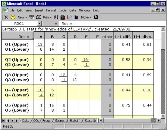
Two rows of results are given for each test item. One row contains response frequencies for the top, or “upper”, group; the other has the frequencies for the bottom, or “lower”, group.
The two right-most columns of the Stats1ul display summarise item difficulty and discrimination, with the difficulty index formed by dividing the number in both groups who got the item correct (13 in the case of Q1), by the total number of people in the groups (32).
One of the main attractions of the U-L approach lies in its discrimination index. It’s simply the proportion of people getting the item right in the upper group, less the same proportion for the lower group. For Q1, this is .81 - .00, or .81.
If the U-L disc. index is 1.00, the maximum possible, it means that everyone in the upper group got the item right, while everyone in the bottom group got it wrong. A result of –1.00, the minimum possible, happens when everyone in the top group got the item wrong, while everyone at the bottom got it right, an unusual and unwanted outcome.
Lertap forms the groups by taking the top 27% and bottom 27% of the test scores, a traditional way of defining the upper and lower groups (see, for example, Hopkins, Stanley, & Hopkins 1990, p.269). It summarises what it’s done at the very end of the Stats1ul worksheet, as shown below:
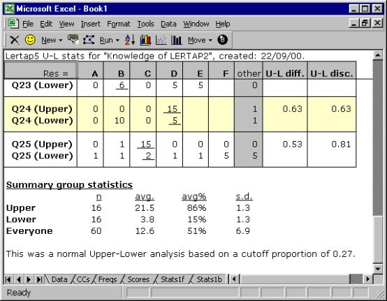
Is it possible to define the groups with different proportions? Yes. The Computation Methods chapter, Chapter 10, explains how.
Mastery test analysis
Look what happens if we change the *sub line for the first subtest so that it includes the word “Mastery”. Thus far the *sub card has been
if we change it to
and then “Interpret CCs lines”, followed by “Elmillon item analysis”, the Stats1ul sheet will look like this:
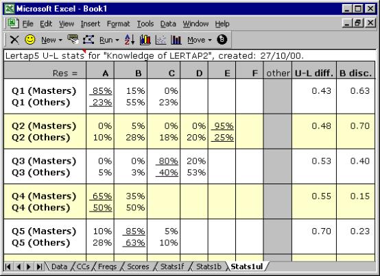
The item-level results are then followed by a variety of statistics which summarise group results, and provide indicators of the reliability of the process:
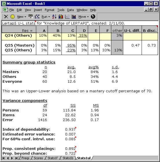
This is a “Mastery” analysis. The top group, the “Masters”, has all those who reached “mastery”, which, above, was set at 70%. The lower group, the “Others”, has everyone else.
The U-L disc. index is now called the “B disc.” index after Brennan (1972). The statistics presented in the lower half of this screen snapshot, from “Variance components” down, come from the work of Brennan and Kane (1977), and Subkoviak (1984). Mention of their interpretation is made later, in Chapter 7.
Is it possible to set the mastery level at something other than 70? Yes. The following *sub line sets it at 80:
*sub
Mastery=80, Res=(A,B,C,D,E,F), Name=(Know. of LERTAP2), Title=(Knwldge), Wt=0
Is it possible to define the upper and lower groups according to performance on an external criterion? Yes. The Run option on Lertap’s toolbar allows for this.
Statistics for affective subtests
Lertap 5 produces two reports sheets for affective subtests, one with “full” statistics, and one with “brief” summaries. These worksheets will have names similar to those for cognitive subtests, such as “Stats1f” and “Stats1b”, where the “f” refers to “full”, and the “b” to (you guessed it:) “brief”.
In the examples below the affective worksheets have names of Stats2f and Stats2b. This is because the CCs worksheet for the example we’ve been following has two subtests—the first one, a cognitive subtest titled “Knwldge”, has been looked at above; because it was the first one in, its sheets have the number 1 (one) in their names, such as Stats1f, Stats1b, and Stats1ul. The affective subtest came next, came second, and as a result its sheets have the number 2 in their names.
Brief statistics for affective subtests
Have a squiz—here are the brief results for the “Comfort” affective subtest (or “scale”):
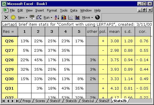
The Stats2b worksheet shown above has its row and column headers hidden at Lertap’s request—you can turn them back on, if you want, by using Excel’s Tools / Options.
The first row of the Stats2b report includes the subtest’s name, “Comfort with using LERTAP2”. Where did this name come from? From the subtest’s *sub card, or line, in the CCs worksheet.
The response codes used by the subtest’s items are shown to the right of the Res = cell, in the second row. This affective subtest used the default response code set of Res=(1,2,3,4,5). If you now were to refer back to the listing of CCs lines, you might wonder why the first subtest, Knwldge, has an explicit Res=() declaration on its *sub card, whereas Comfort does not. The answer has to do with the fact that the Comfort scale used default response codes—Knwldge did not[6].
Looking at the results for Q26, 13% of the respondents opted for the first response, 22% for the second, and so forth. All respondents answered Q26, a fact which is revealed by the absence of an entry under the “other” column. When there’s no response to an item, or an invalid response, Lertap lets you know by putting something in the “other” column.
Q26’s “pol.” is “+”. What’s this mean? It means that positive scoring applies to Q26, or, in other words, that the scoring for this item has not been reversed. If you’re itching to know more about scoring, hang on—it’s coming—there’s more about it in the next section.
The average of the Q26 responses, and their standard deviation, are found under the “mean” and “s.d.” columns, respectively. The “cor.” column gives the value of the Pearson product-moment correlation coefficient between the item and the criterion score. At this point the criterion score is the sum of each person’s responses to the other items on the subtest, that is, the subtest score less Q26. Why exclude Q26 from the subtest score? So that the effects of part-whole inflation are eliminated—the correlation between an item and the subtest score will be inflated if the item is part of the subtest score, and, to control for this, Lertap applies a correction.
More information about this subtest’s items is to be found in the “full” statistics report, Stats2f in this case.
Full statistics for affective subtests
Lertap’s “full” report for affective tests has two main areas, starting with item-level results, followed by various subtest summary sections.
The item results look like this:
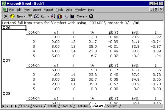
The full statistics for affective items are quite similar to those provided for cognitive items.
Users can check Lertap’s item scoring by looking down the “wt.” column. Here, “wt.” means weight. Above Q26’s weights exhibit “forward” scoring, while Q27’s are reversed—do you see why?
On Q26, a response of 1 (the first option) has a corresponding weight of 1.00, and 5 has a weight of 5.00. These “weights” are what people get for their answers. They’re item scores. Someone who answers 1 on Q26 will get 1.00 points. However, the scoring has been reversed for Q27. An answer of 1 on Q27 equates to 5.00 points. This forward (+) and reverse (-) scoring is defined on the subtest’s *pol card in the CCs worksheet[7].
The pb(r) column gives the point-biserial correlation of each option with the criterion score, that is, the subtest score. At this level, the pb(r) figure is not corrected for part-whole inflation—it is for cognitive items, but not for affective ones, and this subtest, Comfort, is affective.
The “avg.” column indicates the average criterion score for the people who selected each option. On Q26, eight (8) people selected the first option, and their average criterion score was 28.9, or, as a z-score, -1.22.
The criterion score in use at the moment is said to be an “internal” criterion: it’s the subtest score itself. Thus the z-score for Option 1, Q26, is computed by subtracting the subtest mean, 34.5, from 28.9, and dividing the result by the subtest’s standard deviation, 4.6.
Weights for missing affective responses
There were no “other” responses for the two
items shown above, Q26 and Q27. Every
one of the 60 respondents answered these two items by selecting one of the five
options. However, on Q28 two people
declined to respond—their “answers” were entered as a “blank” (a space) in the
Data worksheet. The statistics
corresponding to these two are seen below in the “other” row:
|
option |
wt. |
n |
% |
pb(r) |
avg. |
z |
|
1 |
5.00 |
13 |
21.7 |
-0.42 |
32.4 |
-0.46 |
|
2 |
4.00 |
27 |
45.0 |
0.46 |
36.8 |
0.51 |
|
3 |
3.00 |
10 |
16.7 |
-0.16 |
32.8 |
-0.37 |
|
4 |
2.00 |
8 |
13.3 |
-0.08 |
33.5 |
-0.21 |
|
5 |
1.00 |
0 |
0.0 |
0.00 |
0.0 |
0.00 |
|
other |
3.00 |
2 |
3.3 |
-0.22 |
29.0 |
-1.19 |
It is important to note that Lertap gives a
score to “others”. In this example, the
score for “others” is 3.00 points, which is the middle of the weights for the
item.
The reason Lertap assigns a weight, or score,
for “others” is to try and keep the response summaries “honest”. If “others” got no weight, as is the case
for cognitive items, then the item mean would be lowered, and, if users just
looked at results in the brief stats sheet, Stats2b, a false impression of item
responses might occur—one would have the impression that responses were lower
than they actually were.
Assigning a scoring weight to “others” is
done automatically, and is referred to in Lertap as the MDO, the missing-data
option. This automatic assignment may
be turned off by using the MDO control word on the *sub card, as exemplified
here:
*sub Aff, MDO, Name=(Comfort with using
LERTAP2), Title=(Comfort), Wt=0
Users of previous versions of Lertap will
notice that the way MDO works in this version is opposite to what was
before. Now MDO is always
assumed to be “on”, and the MDO control word on the *sub card extinguishes it.
The item-level information in the Stats2f
sheet is followed by a series of summaries, as shown here:
|
Summary statistics |
|
||||||
|
number of
scores (n): |
|
|
60 |
|
||||
|
lowest
score found: |
|
|
26.00 |
(52.0%) |
||||
|
highest
score found: |
|
|
43.00 |
(86.0%) |
||||
|
median: |
|
|
|
33.00 |
(66.0%) |
|||
|
mean (or
average): |
|
|
34.48 |
(69.0%) |
||||
|
standard
deviation: |
|
|
4.61 |
(9.2%) |
||||
|
standard
deviation (as a sample): |
|
4.65 |
(9.3%) |
|||||
|
variance
(sample): |
|
|
21.61 |
|
||||
|
|
|
|
|
|
|
|
||
|
number of
subtest items: |
|
10 |
|
|||||
|
minimum
possible score: |
|
10.00 |
|
|||||
|
maximum
possible score: |
|
50.00 |
|
|||||
|
|
|
|
|
|
|
|
||
|
reliability
(coefficient alpha): |
|
0.63 |
|
|||||
|
index of
reliability: |
|
|
0.79 |
|
||||
|
standard
error of measurement: |
|
2.81 |
(5.6%) |
|||||
|
mean/max bands |
|
|
.00: |
|
|
.10: |
|
|
.20: |
|
|
.30: |
|
|
.40: |
Q34 |
|
.50: |
|
|
.60: |
Q26 Q27 Q30 Q35 |
|
.70: |
Q28 Q29 Q33 |
|
.80: |
Q31 Q32 |
|
.90: |
|
|
correlation bands |
|
|
.00: |
Q28 Q31 Q34 |
|
.10: |
|
|
.20: |
Q32 |
|
.30: |
|
|
.40: |
Q29 Q30 |
|
.50: |
Q27 Q35 |
|
.60: |
Q33 |
|
.70: |
Q26 |
|
.80: |
|
|
.90: |
|
|
alpha
figures (alpha = .6285) |
|||
|
without |
alpha |
change |
|
|
Q26 |
0.453 |
-0.175 |
|
|
Q27 |
0.550 |
-0.079 |
|
|
Q28 |
0.690 |
0.062 |
|
|
Q29 |
0.574 |
-0.055 |
|
|
Q30 |
0.552 |
-0.076 |
|
|
Q31 |
0.664 |
0.036 |
|
|
Q32 |
0.618 |
-0.010 |
|
|
Q33 |
0.509 |
-0.120 |
|
|
Q34 |
0.730 |
0.102 |
|
|
Q35 |
0.536 |
-0.093 |
|
In the Summary Statistics section, the % figures convert the various summary indices to their percent counterparts, where the percentage values are based on the maximum possible score. Thus, for example, the lowest score found in this group of 60 was 26.00, which is 52% of the maximum possible score, 50.00.
The minimum and maximum possible scores are determined by going over the items, one by one, summing the lowest weights to get the minimum possible total score, and summing the highest weights to get the maximum possible.
The reliability figure reported by Lertap is coefficient alpha, an internal consistency figure sometimes called “Cronbach’s alpha”.
The mean/max bands are based on dividing each item’s mean by the highest item weight. For example, the Stats2b sheet indicates that Q26’s mean was 3.08. The highest weight for Q26 was 5.00, so the item’s mean/max figure was 0.62—this is why Q26 may be seen lying in the 0.60 mean/max band above. These bands make it possible to quickly see where responses were most polarised. In this example, respondents were particularly in agreement on items Q31 and Q32. Of course, a scan down the means column in the Stats2b report will indicate the same (these items have the highest means), but when there are many items the mean/max bands capture the results more efficiently.
The correlation bands simply map the results of the Stats2b “cor.” column, making it possible to rapidly identify those items with the greatest correlation with the criterion score.
The alpha figures indicate how subtest reliability would be affected should an item be removed from the subtest. For example, without Q26 alpha would decrease by –0.175. Note that we’d get quite a nice increase in reliability if Q34 were omitted from the subtest. However, whether or not we’d actually want to delete an item from the subtest does not usually depend on reliability alone, a matter further discussed in Chapter 8.
Those research questions
Back on page 5 we posed a few “research questions” which we proposed to set about answering. And so we have, or almost so. We’ve looked at both the cognitive and affective subtests, finding out which of the cognitive questions were the most difficult. To determine how the subtest scores looked, we activated the histogrammer.
Did the subtests have adequate reliability? Well, the cognitive subtest, “Knwldge”, came through with an alpha reliability of 0.91, standard error of measurement of 8.1% (or 2.03 in raw score terms), which is not bad. The affective subtest, “Comfort”, fared less well, having an alpha figure of 0.63, which is weak. We’d have to have more of a look at that subtest, as it is right now we would not feel confident, not too comfortable (as it were), in using the scores from this subtest as reliable indicators—for the moment, we might compromise by proposing to look at Comfort results only at the level of the individual items.
How did respondent attitudes correspond to how well they did on the cognitive test? The correlation between Knwldge and Comfort was found to be 0.80, which is substantial, perhaps even a bit surprising, given the relatively low reliability of the Comfort scale. We looked at a scatterplot of the two scores, and, although we didn’t say anything at the time, there is a pattern there—people whose Comfort scores were low had low-ish scores on the cognitive test, Knwldge. The very highest Comfort scores, those at 40 and above, also had very high Knwldge scores, with one exception.
We could use Lertap’s support for external-criterion analyses to dig a bit more here, asking for correlations between each of the Comfort items with the overall Knwldge score. We go up to the Lertap toolbar, click on Run, and then on “External criterion analysis”. We tell Lertap to use the Knwldge score as the criterion, that is, the score found in column 2 of the Scores worksheet. Then, when presented with the data set’s subtests, we say “No”, we do not want to “work with” the Knwldge subtest, but then say “Yes” when the Comfort subtest shows up.
Lertap responds by doing its thing, producing item-level summaries of correlations, and then showing its “correlation bands (with external criterion)”:
|
.00: |
Q28 Q31 Q34 |
|
.10: |
|
|
.20: |
|
|
.30: |
Q27 |
|
.40: |
Q32 |
|
.50: |
|
|
.60: |
Q29 Q30 |
|
.70: |
Q26 Q33 Q35 |
|
.80: |
|
|
.90: |
|
Items Q28, Q31 and Q34 actually had negative correlations with the Knwldge score. The same three items had the lowest correlations in the ordinary analysis, as shown in the Stats2b and Stats2f reports. There are things to work on here, more questions to answer. Items Q28, Q31, and Q34 are wanting to stand on their own—the results are indicating that these three questions don’t follow the response pattern exhibited by the other seven items in the Comfort subtest.
What about a relationship between answers to the Comfort items, and “experience levels”? There are two experience variables in the Data worksheet, recorded in columns 38 and 39. Column 39 indicates the number of years the respondent said s/he’d been using computers. Can we correlate Comfort responses with the data in this column of the Data sheet? Yes, you bet. However, the information in column 39 has to be copied to the Scores worksheet first. Lertap’s toolbar has a set of Move options; the first of them allows a column in the Data worksheet to be copied and moved to the Scores worksheet. Once this is done, the Run menu is accessed again, and then an “External criterion analysis” is requested.
When would you want to use Move’s second option? When would you want to copy a column from the Scores worksheet to the Data worksheet? Well, a common case arises when Lertap’s flexible scoring capabilities are used to form affective test scores, which are then moved back to the Data worksheet, after which Lertap’s 8-ball option is used to prepare the data for SPSS analyses.
More reading
There’s more for you to read, to be sure. Chapters 7 and 8 talk about making more use of Lertap’s various reports for cognitive and affective subtests, respectively.
Chapter 9 looks at several matters, including using the 8-ball to set things up for SPSS. Chapter 10 gets into methodology matters, and further describes how Lertap goes about its computations.
More immediately, the chapters which follow this one have to deal with setting up data sets, and creating the system control “cards” necessary to initiate the analyses you want.
References
Please refer to Lertap’s website for a bibliography: www.lertap.com.