Packed quintiles

Contents
Let me come back to this matter of having "discriminating items". If the purpose of the test is to allow us to identify the best students (and, yes, also the weakest students as we might want to provide special tutorials for them), then, the students who get any given test item correct should be the strongest students. They should be the "most proficient" students. Other students should get the item wrong, especially the very weakest of the weakest students.
I step over to the whiteboard and, with a black marker pen, artfully create the following sketches for your admiration:
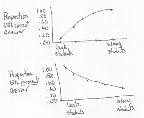
These two wonderfully hand-sculpted graphs are meant to display what we expect of a discriminating item.
Let's say we take a group of students and separate them into, say, five groups according to their proficiency level, which we somehow know in advance. Then we plot the proportion of students in each group who get the item correct (top sketch). We make another plot, the proportion of students in each group who give an incorrect answer to the item (bottom sketch).
These sketches depict what we want of a discriminating item. The chances of a student getting an item correct depend on the student's ability level, on her (or his) degree of proficiency. The stronger the student, the more we expect him (or her) to get our item correct. On the other hand, those students who choose an incorrect answer should be the weaker students. (We assume that the items, as a whole, are neither too easy nor too difficult for the students.)
You okay with this? If not, take a break and come back later. I'm going to step up the action by showing you I13's profile in Lertap's Stats1ul report.
Before I do that let me tell you more about Stats1ul. The "ul" means upper-lower. Lertap's first step in creating this report is to sort all of the test scores from highest to lowest, from upper to lower. It then picks out the top 20% of the scores, and notes the top and bottom test score for the students in this 20%. This it calls the "upper" group. The top and bottom test scores are the score boundaries for the upper group.
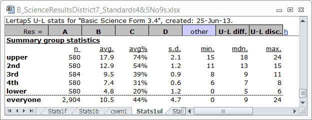
In the table above we see that there are 580 students in the "upper" group, about 20% of the 2,904 students tested. The lowest test score ("min.") in this group was 15, while the highest ("max.") was 24.
Having picked out the top 20%, and found corresponding "min." and "max." score boundaries, Lertap and Excel then get together to identify the next-best 20% of the students, which they call the "2nd" group. This continues into the "3rd", "4th", and "lower" groups.
The "avg." column in the table indicates the average test score found in each group; "avg%" expresses "avg." as a percentage of the maximum possible test score. The "mdn." column is the median test score for each group.
Right, then. Lertap's next step is to find response proportions for each item within each group, and to make another little table for us. Here's the table for I13:
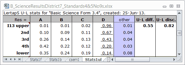
The correct answer to I13 was D. The D column is underlined to signify this. Now, look down this column, and refer back to my first sketch above. We've got the pattern wanted for a discriminating item. The weakest students, those in the "lower" group, had a proportion correct of 0.14. As we step up from the bottom of column D, going from weak to strong students, the proportion correct steadily increases. Almost all of the students in the top group, the "upper" group, got the item correct (proportion of 0.96).
The other columns in the table correspond to incorrect answers, generally called "distractors". Take one of these columns and step up from the bottom. Do you not observe the pattern seen in my second sketch?
I don't. The second sketch is for just the "incorrect answer". I13 has three "incorrect answers". To get a graph which resembles my second sketch, we should sum the proportions for the three incorrect answers. In the lower group the sum is 0.35 + 0.24 + 0.19, or 0.78. If we add to this the proportion who did not answer the item, the "other" column, we find a total proportion of 0.86. If you do this for each group, you'll find that the proportion incorrect goes from 0.81 in the lower group, to 0.80, to 0.57, to 0.34, and then, in the upper group, to just 0.04. We do end up with something akin to my second sketch.
I get a bit bug-eyed looking at Stats1ul tables. To solve this problem I hardly ever look at them at all. Instead I look at the corresponding "quintile plot":
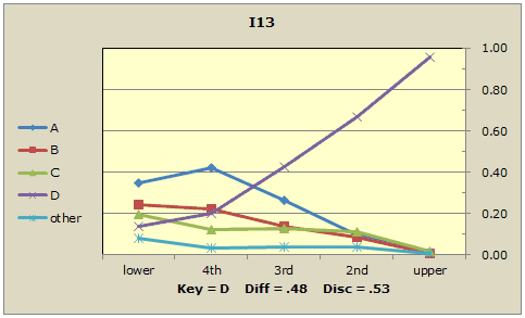
See how the response trace for the correct answer, D, starts low (not many in the lower group got the item correct) but, as student proficiency increases, rises to almost 1.00 in the upper group (where just about everyone got the item correct)? The other trace lines indicate the popularity of each of the distractors, the incorrect answers. Distractor A was especially popular in the lower group (0.35 proportion, or 35%), even more so in the next-lowest group ("4th" group, with 42%), but then, like an aging pop song, its popularity steadily declines. By the time we get to the top group, the "upper" group, only 1% selected this incorrect answer.
We want a test to discriminate? We want items like I13. The correct answer's popularity starts low but rises to just about 100% among the strongest students. The incorrect answers on the other hand, the distractors, will be relatively popular with the weaker students, but virtually ignored by the strongest. Distractor trace lines will fall off, declining as we go from left to right.
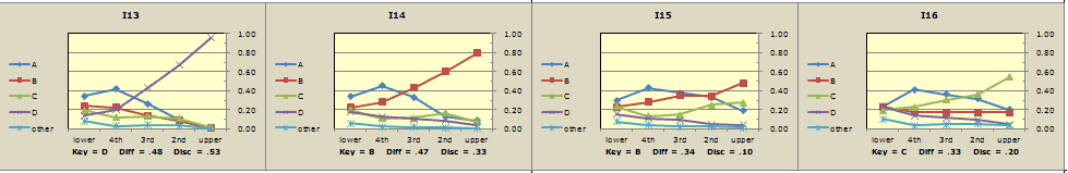
Now, compare this to the fifteenth item, I15:
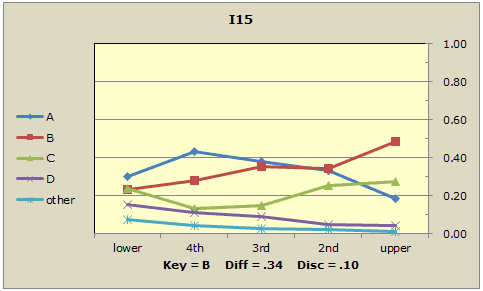
Does the popularity of the correct answer (B) start low and rise to about 100%? No. It rises quite slowly, ending up at about 50% in the top group. Do the distractors, the incorrect answers, fall away as we go from left to right in the graph? A couple of them do, but one, C, definitely does not. It looks like just under 30% of the top students selected this distractor, thinking it to be the correct answer. Another distractor, A, does decline in popularity, but nonetheless was selected by almost 20% of our best students. I15 is not a good discriminator.
Know how I said I get somewhat bug-eyed looking at the tables seen in Stats1ul reports? A bit of the same happens when I look at quintile plots. I know that this feeling is not shared by many Lertap users, but me?, well, I very much prefer the gestalt offered by "packed quintiles".
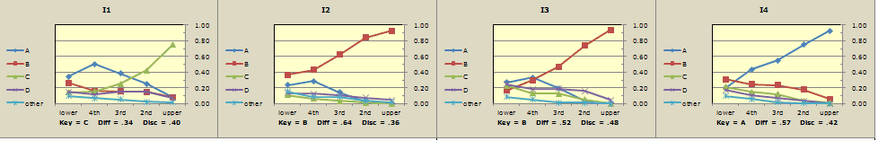
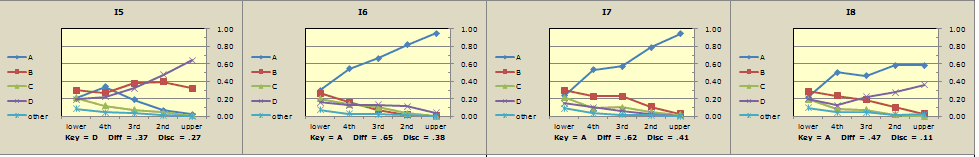
Which of these 24 items display the response pattern desired of a discriminating test?
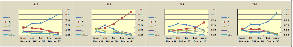
In my opinion, clear winners are items I1, I2, I3, I4, I6, I7, I10, I11, I12, I13, I14, I17, I18, and I20.
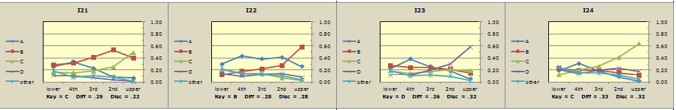
Clear losers might be I5 (one distractor is too popular in upper group), I8 (ditto), I9 (correct answer not high enough in upper group), and items I15, I16, I19, and I21 (all have distractors which fail to decline sufficiently).
The pattern seen in the last three items, I22, I23, and I24, is interesting. These items were probably just too difficult for the students who sat this test: all distractors are heading down on the right (they're "falling away"), and the response trace for the correct answer is rising nicely by the time we hit the upper group -- it's almost as if these three plots would come really good if we could get another group of students more proficient in the subject matter than those in the present upper group.
Our 24-item test would undoubtedly have had better reliability were it not for the seven items in my "clear losers" category. Before this test is used again, I'd get the item writer team together and go over things in a special workshop. Our goal would be to look at the "clear losers" and try to figure out what went wrong with them.
Before doing this, however, I'd make a bit more use of the Stats1b report in combination with Stats1f. Let me show you what I'd do. (Please see the next topic.)