Charts

Contents
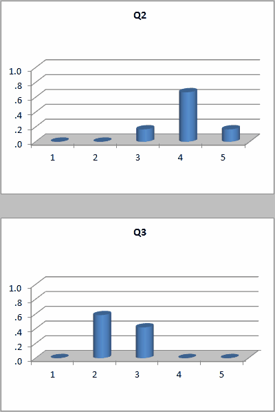
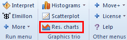
Excel has good capabilities when it comes to making charts. For example, when a Stats1b report has the focus (is the active worksheet), the Res. charts option will make a response bar chart for each item.
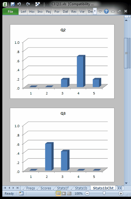
It is possible to quickly change these charts. A click in the chart area with the right mouse button will open up a menu of options. The "ChartChanger1" macro might also be used when it is desired to change all charts at once.
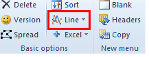
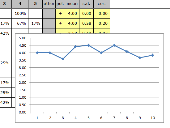
Another Lertap option provides a quick way to make an Excel line graph. For example, to get a graph of the item means, the student would select the values under the "mean" column of Stats1b, and then click here:
This rapidly results in a graph such as the following. Once again this graph, or chart, can be quickly changed by right-clicking on top of it, and then choosing from the options presented by Excel.
Tidbit:
The ChartChanger1 macro may be used to quickly change many of the charts seen on a Lertap report.
For example, it was used to change the response charts above from "3-D Clustered Column" to "3-D Cylinder", producing the examples seen below: