Graphs, charts, and plots
A major feature of Lertap 5 is its Excel base. Excel is well known for its ability to make what it calls "charts", frequently referred to in Lertap 5 as graphs or plots.
A browse of this topic will serve to exemplify some of the most commonly-used Lertap 5 charts. Quintile plots of response trace lines, a crowd pleaser, are demonstrated here, and, more recently in this January 2015 presentation of enhancements.

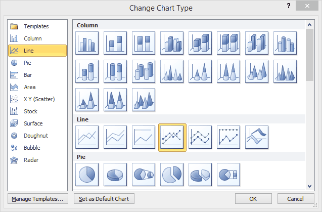
Any of the charts, graphs, and plots created by Lertap 5 may be edited in a manner which many will find familiar: select the chart and then choose from what is often an extensive list of options, such as resizing, colouring, or changing even the "type" of the chart (without losing its link to the data it's based on). Lertap 5 at times provides its own options for changing charts -- here is an example.
