Ibreaks chart type

Contents
The response plots displayed on the previous page use a chart type that's referred to in Excel as a "line" chart.
Versions of Lertap5 dated 26 August 2019 or later use "clustered columns" charts as their default chart type.
The two graphic images below display response patterns for item "i37" from a multiple-choice exam, "Exam1", used as an example in a text by Meyer (2014). Results from this exam are also discussed in this paper (page 15 or thereabout).

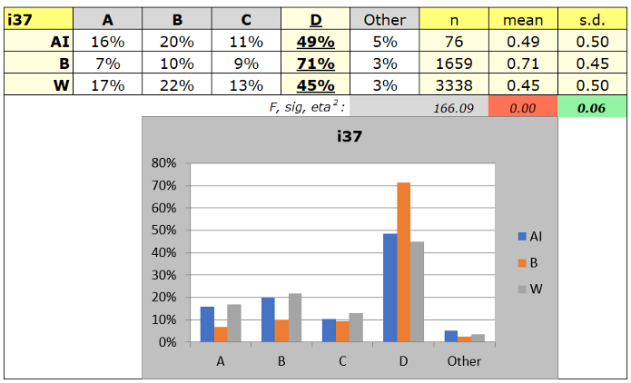
Of these two charts, the first (top) is referred to in Excel as a "line" chart, while the second (bottom) is called a "clustered columns" chart.
The default chart type used by Lertap5 is set in Row 56 of the System worksheet --please refer to this topic.
The next topic mentions another way to get Excel change its chart type.