Scatterplotter

Contents
![]() This icon makes it possible to compare any two columns from the Scores worksheet in a traditional scatterplot, also know as a scattergraph, or a scattergram. A typical plot is shown below, indicating the relationship between the multiple-choice and constructed-response sections of an exam taken by 950 high-school students.
This icon makes it possible to compare any two columns from the Scores worksheet in a traditional scatterplot, also know as a scattergraph, or a scattergram. A typical plot is shown below, indicating the relationship between the multiple-choice and constructed-response sections of an exam taken by 950 high-school students.
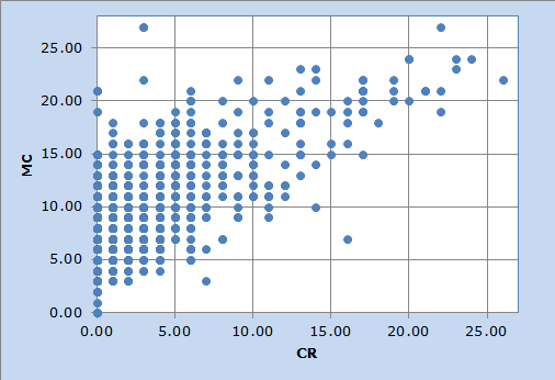
In this case, students found the constructed-response items to be difficult. More than 80% of the students had a score of 5 or less on the "CR" items (out of a possible maximum score of 29; the maximum possible on the "MC" items was also 29 in this example).
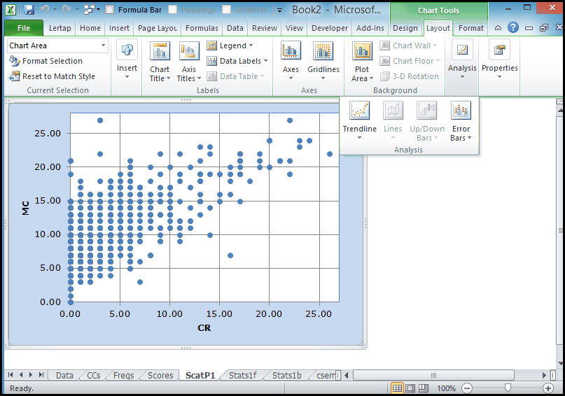
Lertap's scatterplots are Excel charts. They may be extensively reformatted. The axes may be expanded; the colours may be changed; even different symbols may be selected instead of the blue circles seen above. How? Double-click or right-click on various areas of the chart when viewing it in its worksheet. Or, look for help on "About charts" by using Excel Help.
Excel also has some standard data analysis tools which may be quickly applied to scatterplots. How about trying to superimpose a linear trendline over the chart, and getting the value of R-squared to display? In Excel 2010, a click on the scatterplot will activate the "Chart Tools" options, as seen below:
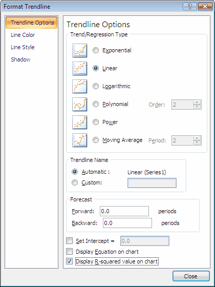
In Excel 2010, the Trendline option is under the Analysis drop-down menu; clicking on it will reveal a box of options similar to this one:
Quicker than you can spread cold butter on cold toast you'll see the result:
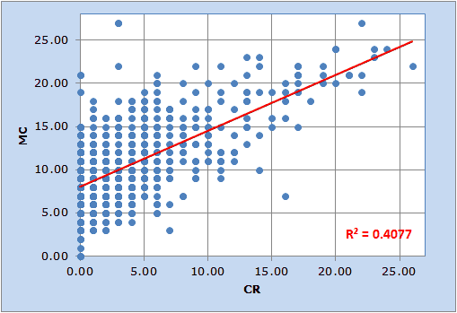
(Note: some formatting was applied to the line and the R2 text box in order to get the display seen here.)
Chapter 10 of the manual has a small section on Scatterplots.