Three of the icons on the Lelpbar get you graphics quickly. Have a squiz at a histogram, scatterplot, and item-response bar chart:
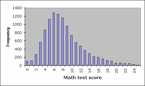
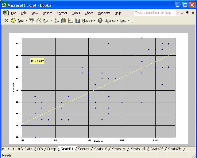
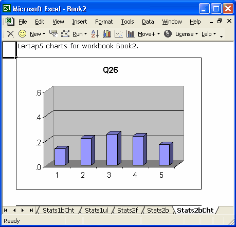
Ready to get down and get really smacked? Look at these plots:
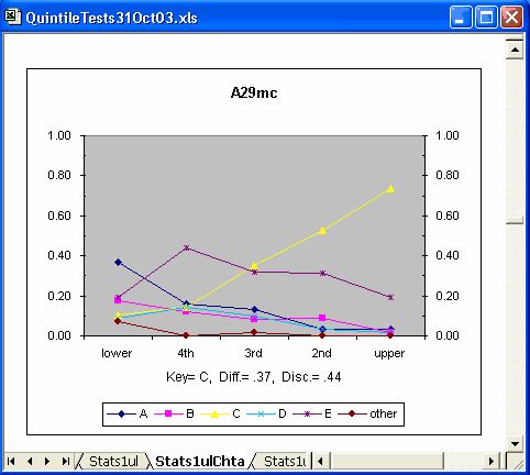
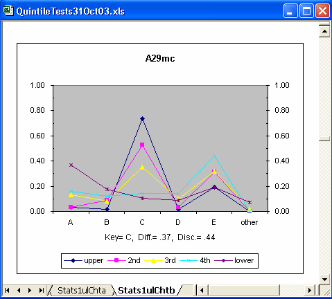
The two smack-plots above depict the performance of item "A29mc", a multiple-choice item with five options, A through E. The first plot is similar to Wainer's (1989) "option trace lines", capturing the performance of each item option over five achievement groups, from lowest (lower) to highest (upper). Note how the proportion of people able to identify the correct answer, C, increases as achievement level increases? Neat.
The second plot essentially swaps the major axis, plotting the five achievement groups over each option. Two of the distractors, A and E, seem to perform fairly well -- particularly A.
Remember my comment about the advantages of having an Excel-based application? The charts above are initiated by clicking on a Lelpbar icon, true, but the actual charts are really made by Excel -- Lertap's toolbar icons just speed up the task (histograms and scatterplots can often be a bit fussy to set up with Excel's chart support; Lertap macros remove most of the fuss).
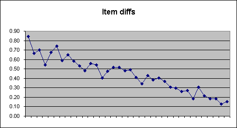
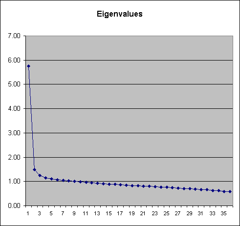
Excel's menu options allows other types of charts to be developed. Line graphs are real easy to do; below I've plotted item difficulties, and then some eigenvalues:
Note inserted 10 May, 2005: the latest version of Lertap includes an option which makes line graphs very easy to get: highlight the row or column with the figures to be line-plotted, and then click on the "Make a line graph" option, available from the Shorts menu.
'nother note, this one 22 September 2009: here's the line plotter working from a Lertap differential item functioning table (y-axis is plotting proportion-correct values while x-axis plots over a selection of an observed-score range from a 40-item test):
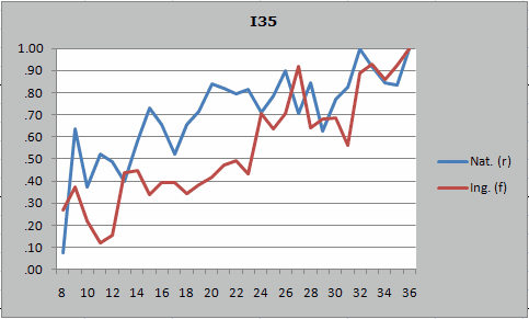
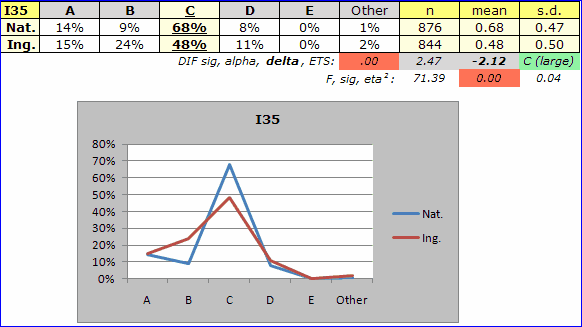
The chart below plots proportion selecting each of an item's options by group, Nat. and Ing. The DIF line gives the probability of Mantel-Haenszel chi-square; the value of alpha, the M-H common odds ratio; M-H delta DIF; and the ETS M-H DIF classification level for the item. The F line is a simple ANOVA table comparing item means for the two groups.
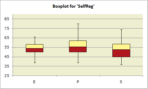
Below, a box plot showing the distribution of test scores in three groups of student trainees:
All charts are easy to modify. For example, I asked Excel to add gridlines and a data table to item A29mc's quintile plot pictured earlier:
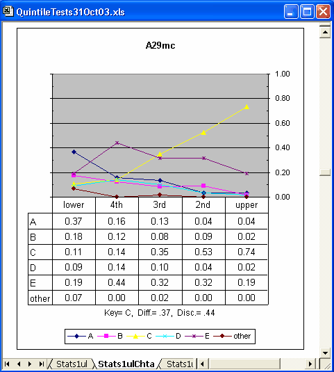
Note inserted 10 May, 2005: new quintile plot options have been added to Lertap 5. One of them will get Lertap to automatically include data tables with its quintiles.


