Histogrammer

Contents
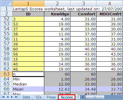
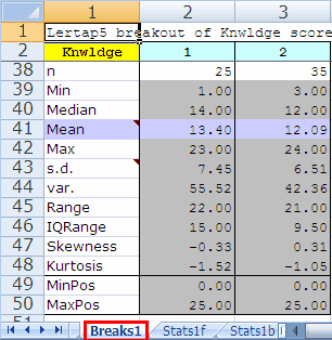
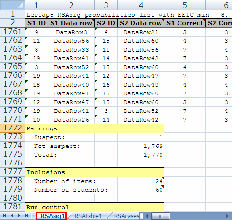
![]() Lertap's histograms are made from the columns of one of three reports worksheets: Scores, Breaks, and RSAsig. An exemplary snapshot of each of these worksheets, or 'reports', is showing here:
Lertap's histograms are made from the columns of one of three reports worksheets: Scores, Breaks, and RSAsig. An exemplary snapshot of each of these worksheets, or 'reports', is showing here:
If you're looking at a Scores, Breaks, or RSAsig report, the histogrammer will swing into action immediately after you've clicked the histograms icon. In the case of Scores and Breaks, it will usually ask you to indicate which column you'd like to 'gram (the question is not required when you're on an RSAsig report as in that case there will be only one column, Log(PROB), to plot).
If you click on the histograms icon whilst viewing another type of report, such as Stats1b, for example, Lertap will take you to the Scores report, and wait for you to click on the icon again. If you didn't want to plot from Scores, you have the chance to click on Breaks or RSAsig instead, after which you have to click on the histograms icon yet again.
The 'histogram' created by the Histograms option is the standard Lertap 5 histogram, dating back to Lertap 2. Its style is exemplified below:
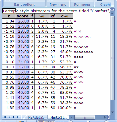
There may not be many columns in this "histogram", but there's a wealth of information:
z |
The z-score corresponding to score. Found by subtracting the overall score mean from the score, and then dividing by the overall score standard deviation (s.d.). The overall mean and s.d. values are found in the Scores worksheet. In this case, the overall mean was 34.48, while s.d. was 4.61. Thus, for the first score of 26.00, z = (26.00-34.48)/4.61 = -1.84. z-scores will be zero when score equals the overall mean. (More z stuff here.) |
score |
These usually start at the lowest score found and end at the highest. However, when the range of scores to be processed exceeds 300, scores are collapsed into intervals and, in this case, the "score" displayed is the center of the interval. |
f |
The frequency of the score. In this case, there was one score of 26.00, no scores of 27.00, and so on. The most frequent score in this case (referred to as the "mode" in the literature), was 32.00, with f=8. When the range of scores is greater than 300, the value displayed for f is the number of scores in the interval mentioned immediately above, under "score". |
% |
The percentage corresponding to f, found by dividing f by the total number of scores (60 in this case), and multiplying by 100. |
cf |
The cumulative frequency, that is, the number of scores at and below score. |
c% |
The percentage corresponding to cf, found by dividing cf by the total number of scores (60 in this case), and multiplying by 100. |
Histograms in this old format are saved in worksheets with names such as "Histo1L", "Histo2L", and so on -- the L is used to refer to the Lertap-2 style.
But wait. There's more to the Histograms option. A click on the arrowhead to the right will get a drop-down box to show, with more options. See:
The Histogram E option will get Excel to look at an L-type histogram, such as found on a Histo1L worksheet, and make a fancier chart, one which may strike you as what folks traditionally expect to see in a histogram.
Note: some versions of Lertap automatically append the "fancier chart" to the output, making it unnecessary to use this option.
Go to a Histo1L or Histo2L (or so on) worksheet, and then click on Histogram E.
You should see a "chart" like this:
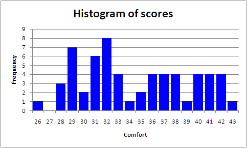
This is an Excel chart, of course, and as such you can do what you want with it. It's real easy to change titles, and colours, and to reformat the values seen along the x and y axes (x=Comfort and y=Frequency in this case).
Scrunch'em? Sounds like it could be painful, eh? Not so, read on ....
It is often the case that a HistoL histogram will have too many intervals. There'll be one interval for each possible score, starting with the minimum score and ranging up to the maximum score. If the minimum score came out to be 4, for example, and the maximum 100, there would be ninety-seven (97) intervals in the HistoL report. Oft times some of the intervals will have no entries; for example, if no-one got a test score of 13, there will nonetheless be an interval in the HistoL report for 13.
The "Scrunch'em" option lets you reduce the number of intervals in a HistoL-type report.
To use it, start by going to a HistoL report, such as, say, "Histo1L".
Then click on Scrunch'em.
Lertap will make a copy of the Histo1L report, calling the copy Histo1LCa. The "LCa" letters mean copy "a" of a compressed L-type histogram (if you use this option again with Histo1L, the next copy will be called Histo1LCb).
You'll then see a little dialog box such as the one seen below:
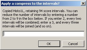
At this point you'll enter a compression factor, an integer, a number from 2 to 9. Let's see -- Lertap says that my Histo1L report presently has 94 intervals. Were I to make an Excel chart from the Histo1L report, using all 94 intervals, I know, from experience, that the chart would either be too large, or, if I've re-sized it to make it small enough to print on a standard page size, it'll be too "busy", too hard to read.
So I'll enter 4 in the box, and click on OK.
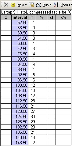
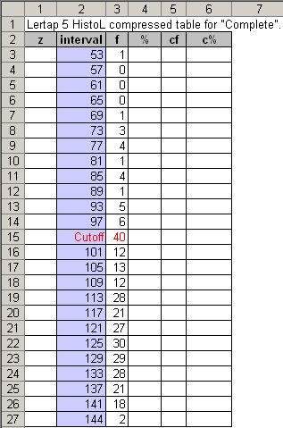
Before you can recite the birth dates of all the ancestors in your family, Lertap will come forth with a nifty table which looks something like this:
If your luck holds good, there will also be a spiffy little chart, a true wonder, ready for inclusion in that report you wanted to have ready for the school board meeting on Monday:

Now, you can do all sorts of things with both the table and the chart shown above.
If you change the entries in the table, the chart will change too, immediately. If you wanted, you could delete the chart, make some changes to the table, and then take the Histogram E option to get the chart back. For example, you could maybe insert a new row in the table to indicate a cutoff point, and then make the histogram chart again:
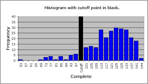
Note that while you were still trying to remember all those birth dates, I got into the chart and fiddled around with it. I changed the title, and the font size of the values along the axes. How'd I get just one bar to be black? By clicking once or twice on the bar, until it was the only selected one. When it had obviously been selected, I then right-clicked on it, and made use of the options which Excel opened for me.
Complete?, you ask. Why is the title on the x-axis "Complete"? Because that's what this test score was called, all the way back in the respective CCs sheet:
![]()
Note that the title of this test, Complete, appears in quotes at the top of the table, in the first row. You can change the title by typing over it, or, more simply, by just changing the title in the chart itself.