Box and whiskers

Contents
Once you've used the Run menu to "Breakout scores by groups", you'll have a Breaks report, a worksheet whose name begins with the word "Breaks".
And, once you have a Breaks report, you can use the "Box and whiskers" option to get a graph which looks like the following (this option is found by clicking on the Run menu's "+ More" section, right below "$ Elmillon"):
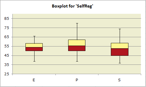
The data plotted above are from the "MSLQ" study mentioned in Chapter 9 of your favorite read, the Lertap manual.
Results from one of the MSLQ scales, "SelfReg", have been plotted for three groups of student teachers: ECE (Early Childhood Education), Primary, and Secondary.
The top of each box corresponds to "Q3", the 75th percentile; the bottom of each box corresponds to "Q1", the 25th percentile. The line in the middle of each box represents the position of "Q2", the median, the 50th percentile.
Shouldn't the median be halfway between the 75th and 25th percentiles? If the distribution of scores is symmetric, yes, but otherwise no. ("Otherwise" is the usual case as scores are not often exactly symmetric about the median.)
The lines sprouting from the top and bottom of each box are the "whiskers". The top whisker extends from the 75th percentile, Q3, to the highest score which is not an "outlier". Similarly, the bottom whisker extends from the 25th percentile, Q1, down to the lowest score which is not an "outlier". Outliers are discussed below.
A plot such as the one above has a lot of information. The Primary students tended to have higher SelfReg scores, and the range of their scores was the greatest: the P group's whiskers extend a bit further than those for the other groups.
The highest median score is found in the P group.
The SelfReg scores of the Secondary students are, by and large, the weakest: their median score and their "Q1" score are lowest of the lot.
How it works
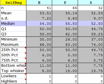
The "Box and whiskers" option works by first making a copy of a Breaks report. If you were looking at a Breaks1 report, for example, then you'll get a new report called "Breaks1bw", with "bw" standing for box and whiskers.
This new report will have a section at the bottom with summary score data organised in the fashion shown here:
Boxplots, also known as box-and-whisker plots, are an invention of Tukey (1977). They're a very useful way to visually compare group scores.
Lertap uses Excel's stacked-column chart as the basis for its boxplots. The core information for the chart is found in the three "Pct" rows: 25th Pct, 50th Pct, and 75th Pct.
The length of each whisker is determined by finding the highest and lowest scores in each group which are not "outliers", that is, not extreme scores. Tukey defined the limits for outliers as 1.5 times IQR, the inter-quartile range, Q3-Q1. Looking at the "P" group in the table above, IQR = 62 - 50, or 12. Multiplying this by 1.5 gives 18; scores above Q3 + 18, and below Q1 - 18, are Tukey's outliers. In the case of the P group, any score above 80 (Q3 + 18) and below 32 (Q1 - 18) will be deemed an outlier.
Many boxplot routines, such as that found in SPSS, indicate the presence of outliers by showing asterisks above and/or below the whiskers. Lertap does something different: if there are outliers, the number of them is shown in the "Lowliers" and "Highliers" rows. The wee table above says (for example), that there are 2 "Lowliers" in the P group. You can see them if you scroll up to the top of the worksheet, as exemplified here:
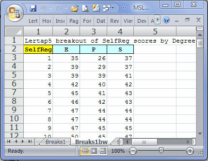
The scores of 26 and 29 are the two outliers for group P. The effective lowest score for this group is 39, which is 11 points below group P's Q1. These 11 points are the length of the "Bottom whisker" for group P.
A histogram would be another way to look at how outlying a Tukey outlier is. If you switch over to the Breaks1 report, and then take the "Histograms" option, using column 3, the column with group P's scores, you'll see something like the following:
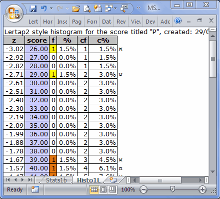
The two Tukey outliers have been highlighted in yellow above, and it's now possible to get another idea of how extreme these scores are: notice the distance between them and the score of 39 (highlighted in orange). These scores are so extreme that they caused the score distribution to have negative skewing (-0.37). However, the boxplot indicates that, once these scores are removed from the scene, the skewing actually appears to be towards the high end of the distribution; this is so as the top whisker in the boxplot is substantially longer than the bottom one.
Note: a common cause of Lertap boxplot failure relates to the codes / names used to label the groups. In this example, the labels are E, P, and S. Failure is likely when the codes are numbers, or single digits, such as 1, 2, 3. And failure is pretty much guaranteed if one of the labels is blank. If you get a message from Lertap or Excel concerning this matter, go back to the corresponding Breaks report, such as Breaks1, and change the codes. Note that it's possible to still use digits if you convert them to text -- an easy way to do this is to simply place an apostrophe before the digits: '1, '2, '3 and so forth.
Flexibility
Once you have one of these boxplots on the screen, it's very easy to alter its appearance. Right-click on the chart, and Excel will open up numerous options. To set the score range used in the plot, right-click on one of the scores seen along the vertical axis, and then take the "Format Axis" options.
Note that you can delete whole columns in the Breaks1bw report, and the corresponding box and whisker set will disappear from the plot. This is useful when you've got too many groups, and want the boxplot to highlight only some of them. For example, if above we eliminated column 2 from the Breaks1bw report, the resultant boxplot would contain just box-whisker sets for the P and S groups.
Related tidbits:
More about the use of Excel stacked column charts for boxplots may be found in work by Jon Peltier (Lertap's boxplots are largely based on Peltier's suggestions):
http://peltiertech.com/Excel/Charts/BoxWhisker.html
Much more about boxplots, or box and whisker plots, may be found on the internet, and in many statistics texts (such as Thompson (2006)).