Breakout scores by groups

Contents
Suspected you were heading for a breakdown? Lertap can help: use its "Breakout scores by groups" option to obtain a summary table and graph comparing score results for various groups.
To use this option you will have a column in the Data worksheet which identifies groups.
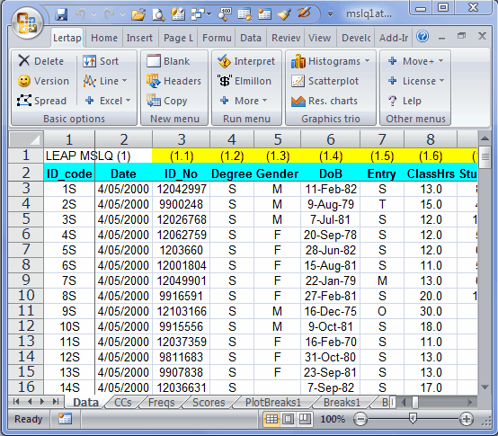
In the sample above, the columns labeled Degree, Gender, and Entry would be typical examples of columns which carry some sort of group information.
Notes: (1) you can change the codes used in columns such as these using the "Recode macro" available via the Move+ Menu. It is also possible to exclude certain cases from the breakouts, such as, for example, cases with missing data. Click here to read more. (2) the codes should not be numbers -- if, for example, one of the columns is Gender, with codes of 1 and 2, use the Recode macro to make a new column with M and F, or Male and Female, or L and P, or whatever is appropriate, as long as the new codes begin with a letter. Lertap's breakouts are very likely to be in error if the codes are numbers.
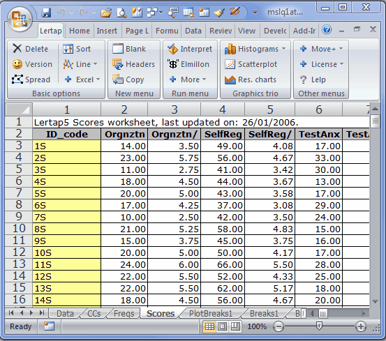
Now, say we had a Scores sheet such as the one above. We might want to cross, say, Degree, column 4 in the Data sheet, with SelfReg, column 4 in the Scores sheet.
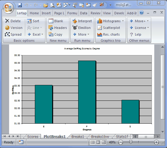
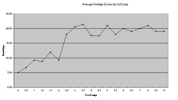
We zip up to the Run menu, click on "+ More", and then on "Breakout score by groups", asking for Data column 4 to be broken out using Scores column 4. Lertap produces a breakout report, and a corresponding plot (the statistics in the Breaks1 report are the same as those seen at the bottom of a Scores report):
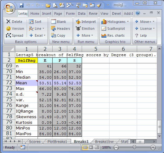
There can be up to 200 levels in the group column. Values in the column may have any length, and may even be numeric. When there are more than 15 levels, Lertap outputs a line graph instead of a bar graph:
It's possible to change just about everything in Excel charts. Right-click here and there on a chart, and see what happens. Change colours, graph styles, and maybe caffeinated coffee to decaffeinated.
P.S.: we need to whisker something in your ear: there's an option which will let you get a boxplot of group results. Give a click about here.
Analysis of variance table
A Breaks report, as seen in worksheets with names such as "Breaks1", "Breaks2", and so on, terminates with "ANOVA", a small analysis of variance table, rather like the one pictured below:
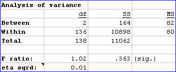
ANOVA tables provide information which may be used to index the extent of group differences. In this regard, perhaps the most critical statistic shown in the table is "eta sqrd.", short for "eta squared". This statistic has a range of 0 (zero) to 1 (one). If the groups differ greatly with regard to the "dependent variable", SelfReg in this case, eta sqrd. will be close to its maximum possible value of 1.00. If there's little difference among the groups, eta sqrd. will be low, as seen in this example where a value of 0.01 has been found.
Eta squared is referred to as an index of "practical significance"; it's also commonly referred to as an "effect size" estimator: the larger eta squared, the greater the differences among the groups. As Pedhazur and Schmelkin (1991) point out, effect size estimators are often interpreted as being measures of "meaningfulness": the greater the effect size, the more meaningful the differences among the groups.
The F ratio seen in the table is used to test a statistical hypothesis, the so-called "null hypothesis": the average value of the dependent variable, SelfReg, in the populations of people from which our groups have been sampled, is the same: the population groups means are equal (so goes the null hypothesis). The F ratio above, 1.02, results from dividing MS (Between) by MS (Within). To test the null hypot, we used to refer to tables of F values -- these days we can simply ask the computer to see how "significant" the F ratio is. Lertap gets Excel to do this, using Excel's in-built "FDist" function. In our case, FDist says that, were the null hypothesis true, an F Ratio equal to or greater than 1.02 would be observed 36.3% of the time, given the sample sizes used in our "study".
If you are familiar with tests of statistical significance, you will know that the usual guidelines suggest that the null hypothesis will be rejected only when we find an F Ratio whose "significance" is .05, .01, or even less. Here our value, referred to as "(sig.)", is .363, well above the .05 level -- if we were really testing the null hypothesis, we would not reject it in this case.
The problem with the F Ratio, and its "significance", is that very small differences in means will sometimes be referred to as being "significant" even when the differences are meaningless; this is prone to happen when sample sizes are large. To circumvent this now well known, widely acknowledged problem, a recommended procedure is to carry along an effect size estimator, such as eta squared: if we find a "significant" F, is it confirmed by a useful effect size (say, for example, at least .10 for eta squared)?
Refer to Thompson (2006), or Pedhazur and Schmelkin (1991), for more readings in this very significant area. Thompson's text is particularly strong on the use of effect-size estimators, and is certainly one of the most compelling sources when it comes to discussing the limitations of tests of statistical significance.