Scores

Contents
Here's an example of a Scores report. It's from the LenguaBIg dataset.
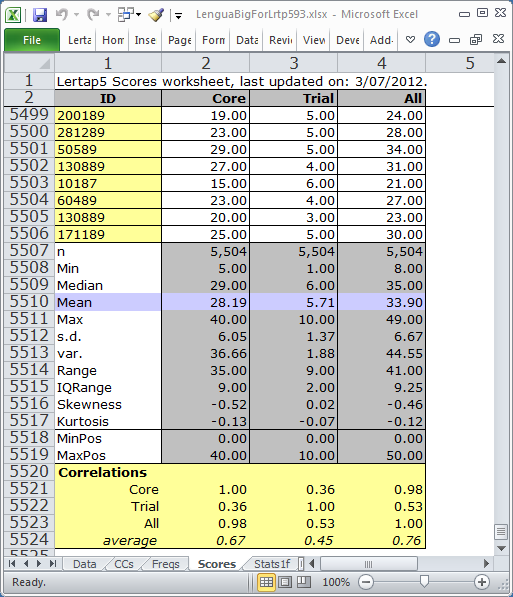
This Scores report has four columns and over five thousand rows. When Lertap creates Score reports, it automatically scrolls the report so that you can see the summary statistics and correlations right away -- they're always at the bottom of the report.
Have a look at the LenguaBIg dataset in order to get an idea of how the three test scores, Core, Trial, and All, were defined (see the dataset's CCs worksheet).
The statistics found at the bottom of a Scores report are explained in the table below.
n |
The number of scores (corresponds to the number of students). |
Min |
The lowest score found. |
Median |
The median score. There will be 50% of the scores below the median and 50% above it. The median corresponds to the 50th percentile of the scores, and is often denoted as Q2 in the literature. |
Mean |
The average of the test scores. |
Max |
The highest score found. |
s.d. |
The standard deviation of the scores. Computed as a "population" value. If you're familiar with the equations used to calculate this statistic, the one used here has "n" in the denominator (not "n-1"). |
var. |
The variance of the scores, computed as a population value. |
Range |
Computed by finding the difference between the highest and lowest scores (that is, in this case, Max minus Min). |
IQRange |
The inter-quartile range, computed by finding the difference between the 75th and 25th percentiles of the scores. In the literature, the 75th percentile is often denoted as Q3, while the 25th is Q1. Thus, the IQRange is equal to Q3 minus Q1. |
Skewness |
This statistic will be zero when the distribution of scores is symmetric about their central value. In this case the Mean and Median will be the same. Negative skewness means that the scores have a tail which extends to the left of the distribution, while positive skewness indicates that the tail is to the right. Lertap uses Excel's SKEW function to compute this statistic. |
Kurtosis |
Kurtosis is an indicator of how peaked the scores are when compared to the normal (or Gaussian) distribution. The normal distribution has a kurtosis value of 3.00. Lertap uses Excel's KURT function to compute this statistic; KURT is actually an index of excess kurtosis, a comparative measure which indicates how the kurtosis of the scores compares to that of the normal curve. Negative values mean the scores are less peaked than the normal curve. |
MinPos |
The lowest possible score on the test. This will always be less than or equal to "Min", the lowest score found. |
MaxPos |
The highest possible score on the test. Always equal to or greater than "Max", the highest score found. |
Correlations |
These appear only when there is more than one score. Each value is the Pearson product-moment correlation between two scores. The average correlation is found by computing the mean of a score's correlations with the other scores. These correlation coefficients may range in value from -1.00 to +1.00. Lertap's Scatterplot option may be used to graph the relationship between any pair of scores. |