Quintile options

Contents
There are a few options which apply to these plots. Almost all of them are controlled by the System worksheet found in the Lertap5.xlsm workbook. Below we've displayed part of the System worksheet (and please note: the next topic has even more options added with the release of version 5.10.5).
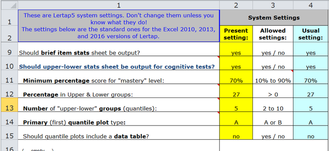
The "quintile options" are set in rows 13 through 15.
Note: more than a dozen new options were added in 2015 with the release of version 5.10.5. Please refer to this key document for much more information, and some fancy new examples.
The number of groups for these plots is seen above in row 13. Its default setting is 5, a setting which gives rise to the term "quintile" plots; the more general term, applicable to any number of groupings, is "quantile".
Changing the number of groups can often result in smoother plots. Ideally we'd like to have, say, at least 50 students in each group -- less than this and these plots can look a bit ragged.
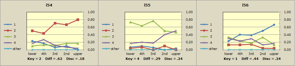
For example, consider a mid-term exam with 68 items and 154 students. With 5 groups of about 30 students each, the plots for three selected items are shown here:
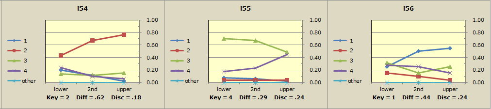
Taking the number of groups down to 3, with about 50 students in each, results in smoother plots in this case (with three groups, these plots would be called "terciles" or "tertiles").
Lertap makes two types of "quintile plots", "quintile-a" and "quintile-b", as discussed earlier. The setting in row 14 of the System worksheet controls which of these plot types is produced first.
The row 15 option in the System sheet, when set to yes, gets Excel to add a data table at the bottom of each plot. Here's a quintile with table:
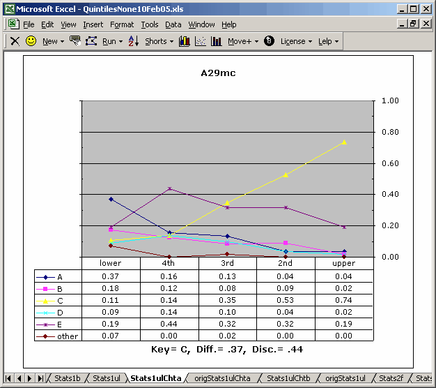
The information in the data table is the same as that found in the Stats1ul report for the respective item.
There's a "data table toggle" which may be used to turn the data tables off. In fact, the same toggle can turn them on if they're off, even when the row15 option is set to "No".
I love quintiles, put yeesch, those colours! They don't look good at all when printed on a black and white printer. Not to worry, help is at hand: see the Chart colors topic.