Quantile Shader 1

Contents
This simple little macro was added to the Lertap5MacrosSetA.xlam workbook early in 2016.
It has some relationship to a setting in row 98 of the System worksheet:

If row 98's setting is "no", the QuantileShader1 macro may be used to lighten up the frames found in quantile plots -- it's an alternative to changing row 98's setting to "yes".
If for example a quantile plot looks like this:
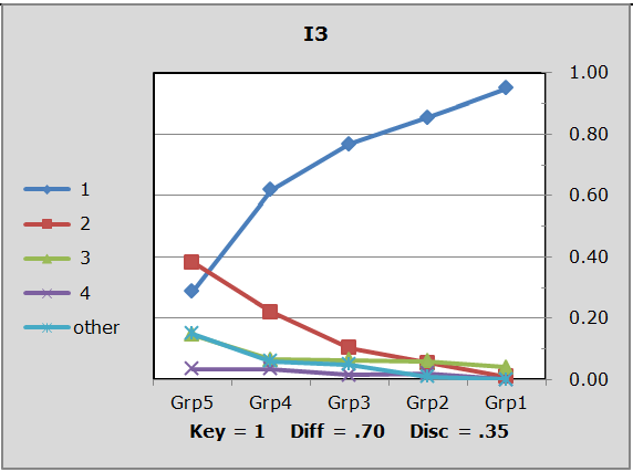
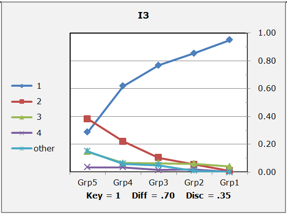
It will look like this after using the macro:
If row 97 is set to "yes", the macro will offer to make black and white copies of the plots:

Note: row 96's setting is ignored in the present version of Lertap 5. "Markers" are the little symbols used in plot lines to help distinguish one line from another. Of the three sample plots shown above, the first two use markers, five per line. The third plot, the black and white one, does not; the black and white plot relies on unique line styles to enable viewers to distinguish one line from another. (These black and white plots are easier to interpret when the chart is expanded by selecting it and then tugging at its edges.)
Another way to remove colors from quantile plots is via the use of a standard Excel color scheme called "Grayscale". Branch to this topic to read about it.