Stats1ul reports

Contents
These reports offer another way of looking at how items have performed, one which does not rely at all on the use of correlation coefficients. To some people they're easier to understand. Stats1ul reports provide the gateway to Lertap's very popular "quintile plots".
The "ul" in Stats1ul means "upper-lower". To make a Stats1ul report, Lertap begins by sorting all test scores from highest to lowest. It then uses the sorted scores to form groups of students. The top students go into a group called "Grp1" while the weakest students, the lowest-scoring ones, will go into a group denoted as "GrpX", where X is equal to the total number of groups.
When this method was initially devised, a long time ago, before computers became commonplace, it was often referred to as the "high-low" method, and only two groups were used: the top 27% and the bottom 27% (see Chapter 10 of the manual for more information).
Lertap has a setting in its System worksheet which determines how many groups will be formed. The minimum is two, the maximum is ten, the default is five. When the default value is in effect, the lowest-scoring group will be known as "Grp5".
The snapshot above depicts a typical Stats1ul report for three items from the M.Nursing dataset, using the default setting of five groups, with 20% of the students in each group.
Results for three items are shown. As you look at them, remember that the figures for an item's correct answer are underlined. The correct answer to the item called "NM8" was B, for example. The figures shown in the main part of the display indicate the proportion of students in each group who selected the item's options.
When we want our items to be ones which are capable of discriminating among the students, picking out the strongest while simultaneously identifying the weakest, then the best students should get the items right, while the weakest falter. This happened on two of the items seen above: item NM9, and item NM10.
On NM9, 72% of the students in the upper group picked out the right answer, dropping steadily to 20% in the lower group. A similar pattern was noted on NM10, although the drop was not quite as marked as 43% of the lower students got the item right.
NM8 was a different case. There's only a small difference between the top and bottom groups, with 39% of Grp1, the top group getting it right, compared to 29% of the low group, Grp5. A closer look reveals that the top group was quite undecided on NM8; many students in this group thought that option C was a good choice, and a fair number also went for option D.
The "other" column gives the proportion of students who did not select one of the item's options, or who had an "invalid response" (which might come from shading in more than one answer of a "bubble" answer sheet).
"U-L diff" is a measure of item difficulty, corresponding to the proportion of students who got the item correct (over all groups). It will usually closely correspond to the "diff" value seen in the Stats1b report, and to "p" in Stats1f .
"U-L disc" is an index of item discrimination, designed to be easy to understand: it's simply the difference between the proportions of correct answers in the upper and lower groups. For NM8, the corresponding proportions are 0.39 and 0.29, giving UL-disc=0.10. UL-disc values will frequently differ from the "disc" figure found in Stats1b, and from the "pb(r)" in Stats1f; Stats1b and Stats1f use correlation methods to index discrimination, while, as we have seen, Stats1ul uses simple proportions. When an item's "U-L disc" is less than zero, red coloring is used to "flag" this unwanted outcome.
NM9 had the best discrimination of these three items, with UL-disc=0.51 (all of the proportions have been rounded; it would appear that UL-disc for this item should be 0.72-0.20=0.52, but the 0.72 has been rounded up from 0.716713 -- you can always see the unrounded figures by turning on Excel's Formula Bar).
Although the statistics which underlie Stats1ul reports are quite simple ones, based on proportions, nevertheless there's a lot of information to take in. As an alternative to the tables, Lertap is most happy to turn them into charts which are often easier to interpret. Look:
|
|
|
|
|
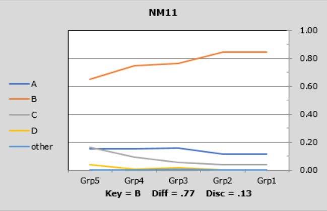
The lines in these graphs are referred to as "trace lines" as they trace how each item's options "perform" in each group. When the Stats1ul results are based on five groups, these graphs are called "quintile plots".
What we frequently want to see is a pattern like that seen for items NM9 and NM10. In the lower group, "Grp5", the proportions for the options should be fairly similar, while in the upper group, "Grp1", most students will (hopefully) be able to identify the correct answer, making the trace lines sort of fan out as they head to the right.
NM8 shows the often-desired pattern in the lower group, but fails to fan on the right.
NM11 was quite easy, even in the lower group. It has no chance of fanning out on the right as it has essentially already fanned on the left.
Graphs such as these are so popular they've spawned numerous supporting documents. Click here for more information.
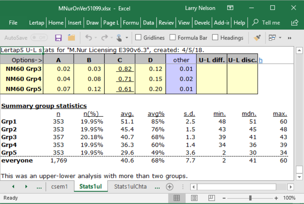
Stats1ul reports always have a little table at the bottom, such as that shown above. In this case, Lertap has formed five groups, each with about 20% of the students.
n |
The number of students in each group. |
avg. |
The mean (or average) of the test scores for the group. |
avg% |
The avg. figure expressed as a percentage of the maximum possible score (which was 60 in this case). |
s.d. |
The standard deviation of the scores for the group. Computed as a "population" value. If you're familiar with the equations used to calculate this statistic, the one used here has "n" in the denominator (not "n-1"). |
min. |
The lowest, or minimum, score found in the group. |
mdn. |
The median of the group's scores (the 50th percentile). |
max. |
The highest, or maximum, score found in the group. |
Related tidbits:
The screen snapshots seen above were taken from an analysis of the exam responses given by a class of nursing students.
In earlier versions of Lertap 5, no matter how many groups there were, the top group was always called the "Upper" group, while the bottom group was always referred to as the "Lower" group. These labels are also seen in the manual.
Quintile plots have given rise to the term "visual eye-tem analysis", as seen in this paper.
How to print Lertap's reports? See this topic.