Over to Lertap

Contents
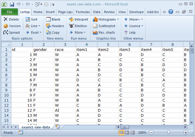
We're breezing into this topic with an Excel workbook which looks like this:
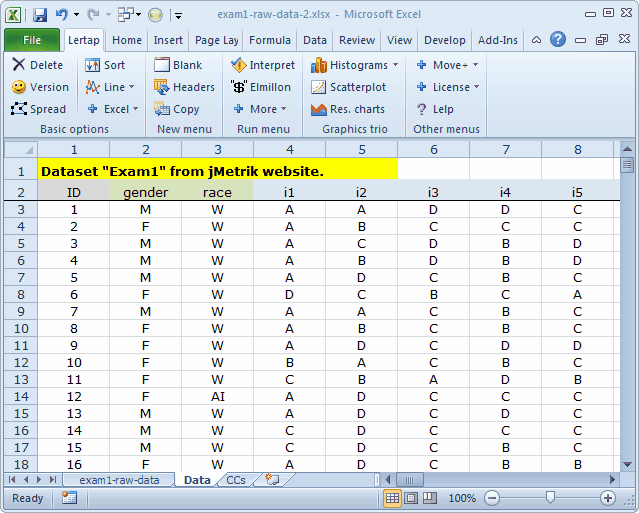
We want to use Lertap to process the data found in this worksheet. We need to have two new worksheets in order to do this. One of these new sheets has to be called "Data", while the other must be named "CCs".
The steps we started with in the last "Over to Lertap" topic serve as a great example. We'll make a copy of the present worksheet, "exam1-raw-data", and name the copy "Data". We'll insert a new row at the top because Lertap wants the columns headers (id, gender, race, item1 ...) to be in the second row.
Then we'll change the names of the items so that they will display a bit better when Lertap gets Excel to make charts. (This isn't necessary at all, but it's sort of a personal preference here at Lertap HQ. Short item handles have some practical advantages when the charts are made. Some discussion of this may be found here.)
Finally, we'll insert a new worksheet, calling it "CCs".

With everything now set up, we can follow those Lertap steps you already know about and have come to cherish.
2) Use the Interpret option on the Lertap tab.
3) Use the Elmillon option on the Lertap tab. |
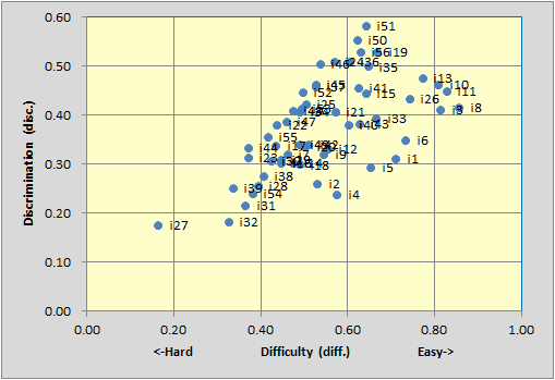
Should you be stuck inside your office, supposedly marking student assignments, but just itching instead to work through this sample, we can tell you that Lertap's Stats1f report indicated a reliability figure (coefficient alpha) of 0.91 for this test.
The Stats1b scatterplot of item difficulty by discrimination looked like this:
Tidbits:
In May 2016 a special macro was created to do the work described above, making it much, much easier to bring csv files into Lertap. The macro is called "ImportCSV".
There are without doubt numerous exercises that could be undertaken with this dataset.
We might begin by looking at the quality of the data, browsing down the Freqs report to check make sure that the responses found in the Data sheet's columns were as expected (A B C D with some entries anticipated in the ? rows).
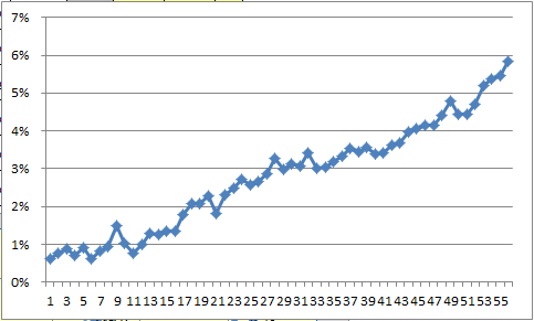
This seemed to be a speeded test, that is, a test with an allotted time too short for all students to get to the end of the items. If this were the case, we should see the percentage of ? entries increasing as we work down the Freqs report (and indeed we do -- if you have a close look at the data, you'll find that 20 some records were missing responses on the first 32 items of the test, a curious state of affairs).
The following chart plots the percentage figure from Freqs' ? row for all of the items. How do you suppose this was done? (Hint: use a column from the Stats1b report. It takes all of two seconds to get such a graph if you use the "Line" option on Lertap's "Basic options" menu.)
Does a histogram of the test scores suggest any anomalies, such as an outlier or two or more at the low end?
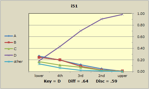
How many of the test's 56 items had flags in the Stats1b ? column? What may have been the problem with these items? How would coefficient alpha change if these problems were addressed, perhaps by double-keying (assuming the problems are substantial enough to warrant this; they may not be)?
What do the quintile plots for these items look like? Here's one:
What about the matter of group differences? This dataset has two demographic variables, gender and race. If you need more of an excuse to keep from marking assignments, you have it.