Ibreaks charts

Contents
The charts, or plots, seen in the previous topic were based on right / wrong cognitive items, and only two groups.
The plot below is from the dataset used in the Breakouts topic. It used affective scales, many with items having seven response options. Three groups were involved.
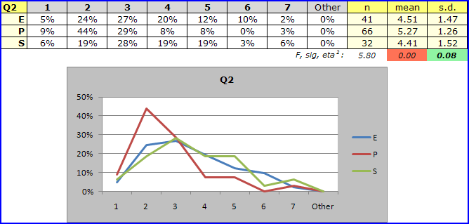
Q2 is an affective item from the 'MSLQ' instrument developed at the University of Michigan. MSLQ items typically ask students how often they had used a particular learning or study strategy during a given time period. For example, the item stem might be "During the past week, how often did you meet with other students to go over material presented in lectures?" Responses to some MSLQ items are gathered with a 7-point scale, ranging (for example) from 'Every day' to 'Never'.
The graph for Q2 seen above suggests that the 'P' (Primary) group made more use of the strategy than did students in the other groups.
It is easy to change Excel charts. Easy! Right-click on one, somewhere around the title (Q2 above):
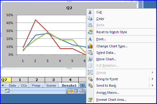
Click on "Change Chart Type...", and say goodbye to the next two hours. Below is a rather crude chart change -- it's not difficult to make something which is more sophisticated.
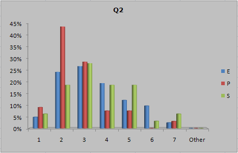
Let Ibreaks create its usual response charts, which are, in Excel chart parlance, "Line" charts (but see this topic for an update: the default chart is now a "clustered columns" type). Then select any chart, and modify it to your heart's content. Save the result as a chart template. The, click on any other chart, and apply the template to it.
Or: use the ChartChanger1 macro to modify the chart type in one go -- with this special macro, all you do is tizz up the first chart, apply the macro, and all following charts are tizzed. See the following topic.
Move 'em, Dan-O!
Alright, you may not be a fan of Hawaii 5-O, but here's another note, one which will be a bit more useful when we get into the DIF topic.
If you might want to move charts to a worksheet of their own, create a new worksheet, then use the "Move Chart..." option (seen above) to shift a selected chart to the new worksheet. Move one, two, or how ever many you want, and (in theory) they will line up well in the new worksheet.
Related tidbits:
One of our videos shows how to use many of the Ibreaks features -- see Video (5) at this webpage.
There are many books on using Excel charts. See, for example, John Walkenbach (2007): Excel 2007 Charts, Wiley Publishing, ISBN 978-0-470-04400-1.