Stats1ul report (the upper-lower scoop)

Contents
"Stats1ul" means upper-lower statistics. If the CCs worksheet refers to more than one subtest, as is the case with the CooksTour sample, there will be one "ul" report for each subtest. Their names will be Stats1ul, for the first subtest, Stats2ul for the second, and so on.
The Stats1b and Stats1f reports use correlation coefficients to index how items are discriminating. Stats1ul reports use quite a different method. They're based on a procedure used before we had personal computers. A suggested method for determining if an item was discriminating involved these steps: (1) score all of the tests (by hand, of course); (2) take out the top 27% of the test papers, calling this the upper group; (3) take out the bottom 27% of the test papers, calling this the lower group; (4) for each item, find the proportion of students in each group who got the item correct, call these proportions Prop(upper) and Prop(lower); (5) finish by subtracting Prop(lower) from Prop(upper).
Why 27%? Garret (1952, footnote on p.215), wrote: "When the distribution of ability is normal, the sharpest discrimination between extreme groups is obtained when item analysis is based upon the highest and lowest 27 per cent in each case ....". The Lertap manual has more about this in Chapter 10; Chapters 3 and 7 of the manual also discuss U-L, the upper-lower method.
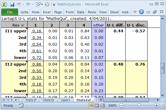
Despite this well-regarded historical antecedent, when you get Lertap at the store, take it home and unwrap it, you will find that Lertap's U-L report looks like this:
Lertap's default U-L activity is to separate the test takers into quintiles, five groups, with about 20% in each. There's always a small table at the bottom of a Stats1ul report which summarises this:
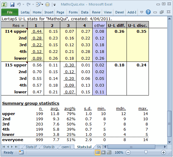
The 199 "upper" students, those with the top test scores, had an average of 11.8, or 79% of 15, the maximum possible score. The lower quintile, housing those 199 scores at the lowest end of the score distribution, had an average of just 3.8, or 25%.
We can use these little tables to re-visit the items discussed in the previous topic.
I11 is clearly whomperjawed. The keyed-correct option, 1, was selected by just 16% of those in the upper group, compared with 72% in the lower group. On the other hand, look at the response pattern for I11's option 4: 84% endorsement in the top quintile, only 11% in the lower. We mentioned before that this item was incorrectly keyed, and here we can see it readily. If we want to have a discriminating item, it should be the strongest students, the upper quintile, who get the item right.
I14 and I15 have positive U-L disc. values, but note: were the correct answer to I14 the fourth option, the U-L disc. would still be positive (0.27 minus 0.22). Were the correct option on I15 the first option, the U-L disc. would be again be positive (0.09). These results run counter to what we want to see. For a distractor, we want the proportion selecting it to be lowest in the upper group, highest in the lower group.
Would it not be nice to have a picture to go along with these tables? Can do? You bet. We'll get some "quintile plots".
While looking at a Stats1ul report, go to the "Graphics Trio" part of the Lertap tab, and select the last option, "Res. charts".
Lertap and Excel will team up to make pictures which will surely rival those from your last holiday. Behold:
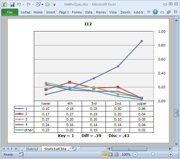
This "picture" is a quintile plot.
Look at the blue line above. It corresponds to the keyed-correct answer for I12. As the students gain in proficiency, their ability to identify the correct option increases. That is, as we go from left to right, from the lower group to the upper one, the line in the plot which traces the proportions for the correct answer, Key=1 in the table, rises, from 0.10 on the left, to 0.86 on the right. This is a good plot. It's what we want to see for a discriminating item.
(The Diff. and Disc. values seen at the bottom of the plot come from the Stats1b report.)
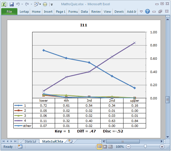
One of the first things to note about I11's plot is that only two of the item's options, 1 and 4, attracted any students to speak of. This isn't uncommon; it's not ideal, but it certainly happens.
The next thing to note is that the line which rises from left to right corresponds to a distractor, option 4. The line for the keyed-correct option, 1, has the pattern expected of a distractor. This is the mis-keyed item. Were we to correct the error, the plot would look the same, but the Disc. value at the base of the plot would be positive, and we'd see Key=4 instead of Key=1.
If you take on the challenge of downloading the MathsQuiz workbook, and repeating the various things we've done here, you will notice that most of the test's items have a pattern similar to I12's. We know people who base their item analysis very largely on an examination of these quintile plots, using the plots to visually identify good and bad items. While this is certainly a solid approach to item analysis, some care has to be taken: just scrolling down the plots without looking at the Disc. values can lead to problems -- for example, a simple scroll of this test's quintile plots would not uncover the error in I11, an item whose plot appears to be okay in that it has one trace line which rises, and almost dramatically, from left to right. The problem this item has is not apparent without looking at the Disc. value, or the row in the table corresponding to Key=1.
Items which may have some ambiguity in them will generally have a plot similar to I14's, as shown below:
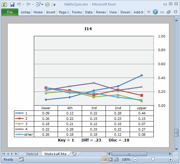
This is a hard item, having a Diff. of just 0.23. The Disc. value is positive, and the trace line for the keyed-correct option, 1, does indeed rise as we move from left to right. However, the traces for the distractors do not all decrease from left to right. One of them, corresponding to option 4, actually rises. Another distractor, option 2, remains fairly strong in the upper group, with an endorsement of 15%. These figures imply that the top students were split on this item, with more than a quarter of them selecting option 4, a distractor.
Tidbits:
The criterion score used to form the U-L groups is generally an internal one, the test score itself. However, it is possible to use an external criterion.
While the default U-L number of groups is 5, it can be set to a smaller number by changing an entry in the System worksheet. And, it's possible to reverse the rows and columns in the tables which underpin these plots, getting another type of picture (neat). Read about such morsels here.
The matter of using quintile plots as a primary means of identifying good and not-so-good items is further discussed in a Lertap "erudite epistle". It's the "Visual item analysis with quintile plots" paper. Download this PDF.